Credroad
Credroad
Credroad
Credroad
Region
Region
USA
USA
Year
Year
2024
2024
Year
2024
Region
USA
Region
USA
Year
2024
Credroad
Voo's Cinema
Voo's Cinema
Voo's Cinema


the project itself :
the project itself :
the project itself :
the project itself :
the project itself :
Project Overview
Project Overview
Project Overview
Project Overview
Project Overview
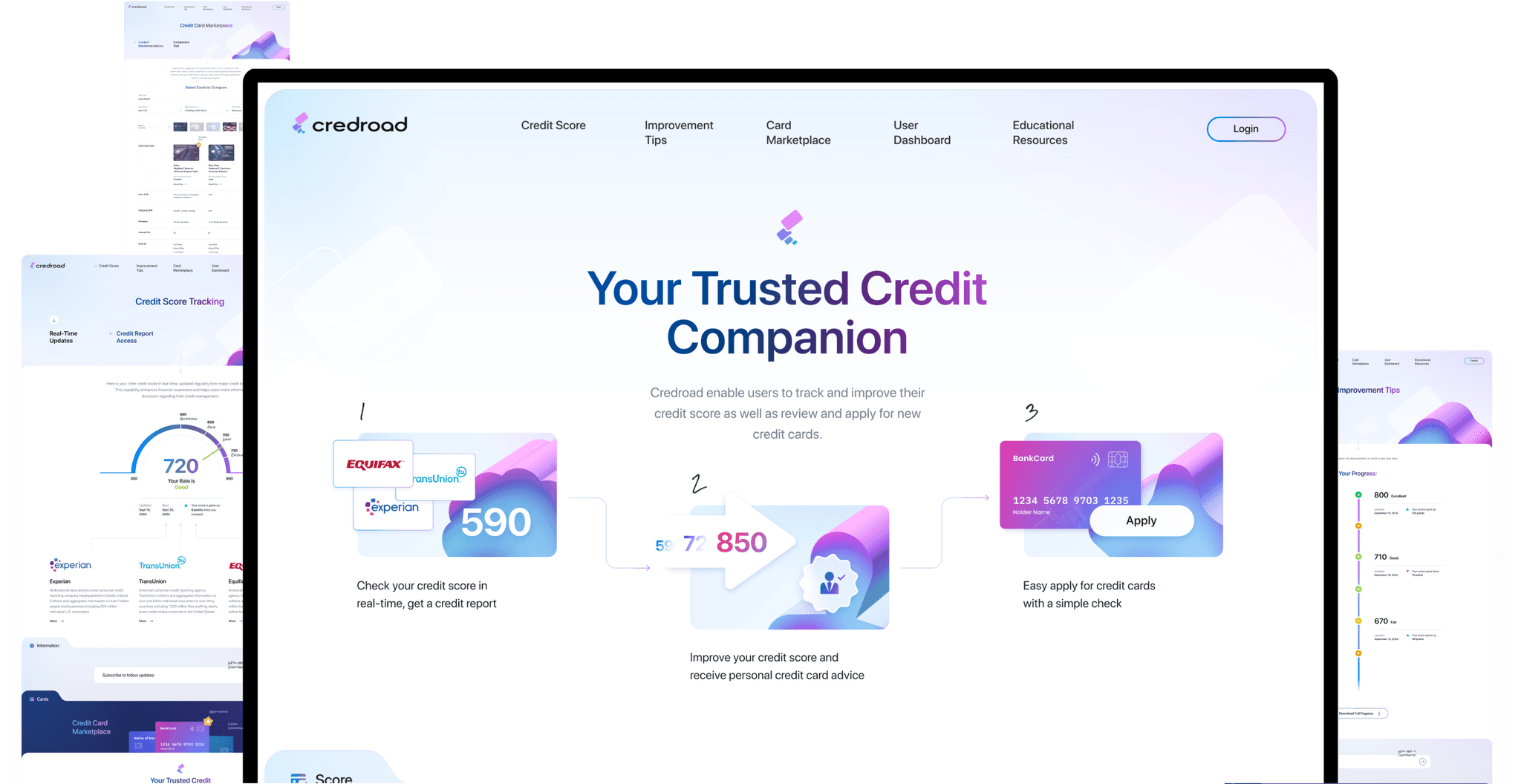
Credroad a personal credit-management responsive website which enable users easily to track and improve their credit score as well as review and apply for new credit cards based on criteria such as lowest interest rate.
Credroad a personal credit-management responsive website which enable users easily to track and improve their credit score as well as review and apply for new credit cards based on criteria such as lowest interest rate.
Credroad a personal credit-management responsive website which enable users easily to track and improve their credit score as well as review and apply for new credit cards based on criteria such as lowest interest rate.
Credroad a personal credit-management responsive website which enable users easily to track and improve their credit score as well as review and apply for new credit cards based on criteria such as lowest interest rate.
Problem:
Problem:
Problem:
Problem:
Problem:
Most existing credit services fail to clearly and simply explain how to improve credit scores, recommend the best credit cards, or provide other essential information all in one place for the average user.
Most existing credit services fail to clearly and simply explain how to improve credit scores, recommend the best credit cards, or provide other essential information all in one place for the average user.
Most existing credit services fail to clearly and simply explain how to improve credit scores, recommend the best credit cards, or provide other essential information all in one place for the average user.
Most existing credit services fail to clearly and simply explain how to improve credit scores, recommend the best credit cards, or provide other essential information all in one place for the average user.
Goal:
Goal:
Goal:
Goal:
Goal:
Project allows pass the crediting process step-by-step with all the information and hints in easy way.
Project allows pass the crediting process step-by-step with all the information and hints in easy way.
Project allows pass the crediting process step-by-step with all the information and hints in easy way.
Project allows pass the crediting process step-by-step with all the information and hints in easy way.
My role:
My role:
My role:
My role:
My role:
UX designer leading the CredRoad website design.
UX designer leading the CredRoad website design.
UX designer leading the CredRoad website design.
UX designer leading the CredRoad website design.
Responsibilities:
Responsibilities:
Responsibilities:
Responsibilities:
Responsibilities:
conducting research,
storyboarding,
paper and digital wireframing,
conducting research,
storyboarding,
paper and digital wireframing,
conducting research,
storyboarding,
paper and digital wireframing,
conducting research,
storyboarding,
paper and digital wireframing,
usability studies,
iterating on designs,
making high-fidelity prototype
usability studies,
iterating on designs,
making high-fidelity prototype
usability studies,
iterating on designs,
making high-fidelity prototype
usability studies,
iterating on designs,
making high-fidelity prototype
all about the user :
all about the user :
all about the user :
all about the user :
all about the user :
User research
User research
User research
User research
User research
I conducted user interviews and created empathy maps to gain a deeper understanding of the target user and their needs. I found that many users struggle to understand how to navigate credit resources. They want a straightforward, easy-to-use product without needing to dive deeply into credit complexities. The information overload is confusing, and they simply seek a smooth, successful experience when obtaining credit.
I conducted user interviews and created empathy maps to gain a deeper understanding of the target user and their needs. I found that many users struggle to understand how to navigate credit resources. They want a straightforward, easy-to-use product without needing to dive deeply into credit complexities. The information overload is confusing, and they simply seek a smooth, successful experience when obtaining credit.
I conducted user interviews and created empathy maps to gain a deeper understanding of the target user and their needs. I found that many users struggle to understand how to navigate credit resources. They want a straightforward, easy-to-use product without needing to dive deeply into credit complexities. The information overload is confusing, and they simply seek a smooth, successful experience when obtaining credit.
I conducted user interviews and created empathy maps to gain a deeper understanding of the target user and their needs. I found that many users struggle to understand how to navigate credit resources. They want a straightforward, easy-to-use product without needing to dive deeply into credit complexities. The information overload is confusing, and they simply seek a smooth, successful experience when obtaining credit.
Pain points
Pain points
Pain points
Pain points
Pain points
Information:
Information:
Information:
Information:
Information:
Credit resources are often overloaded with information, making it unclear what actions to take. A simple, user-friendly personal credit solution is lacking in the market.
Credit resources are often overloaded with information, making it unclear what actions to take. A simple, user-friendly personal credit solution is lacking in the market.
Credit resources are often overloaded with information, making it unclear what actions to take. A simple, user-friendly personal credit solution is lacking in the market.
Credit resources are often overloaded with information, making it unclear what actions to take. A simple, user-friendly personal credit solution is lacking in the market.
Interaction:
Interaction:
Interaction:
Interaction:
Interaction:
Websites often contain numerous unclear elements placed in the wrong locations.
Websites often contain numerous unclear elements placed in the wrong locations.
Websites often contain numerous unclear elements placed in the wrong locations.
Websites often contain numerous unclear elements placed in the wrong locations.
Experience:
Experience:
Existing sites usually provide unclear user experience.
Existing sites usually provide unclear user experience.
Existing sites usually provide unclear user experience.
Existing sites usually provide unclear user experience.
User personas
User personas
User personas
User personas
User personas
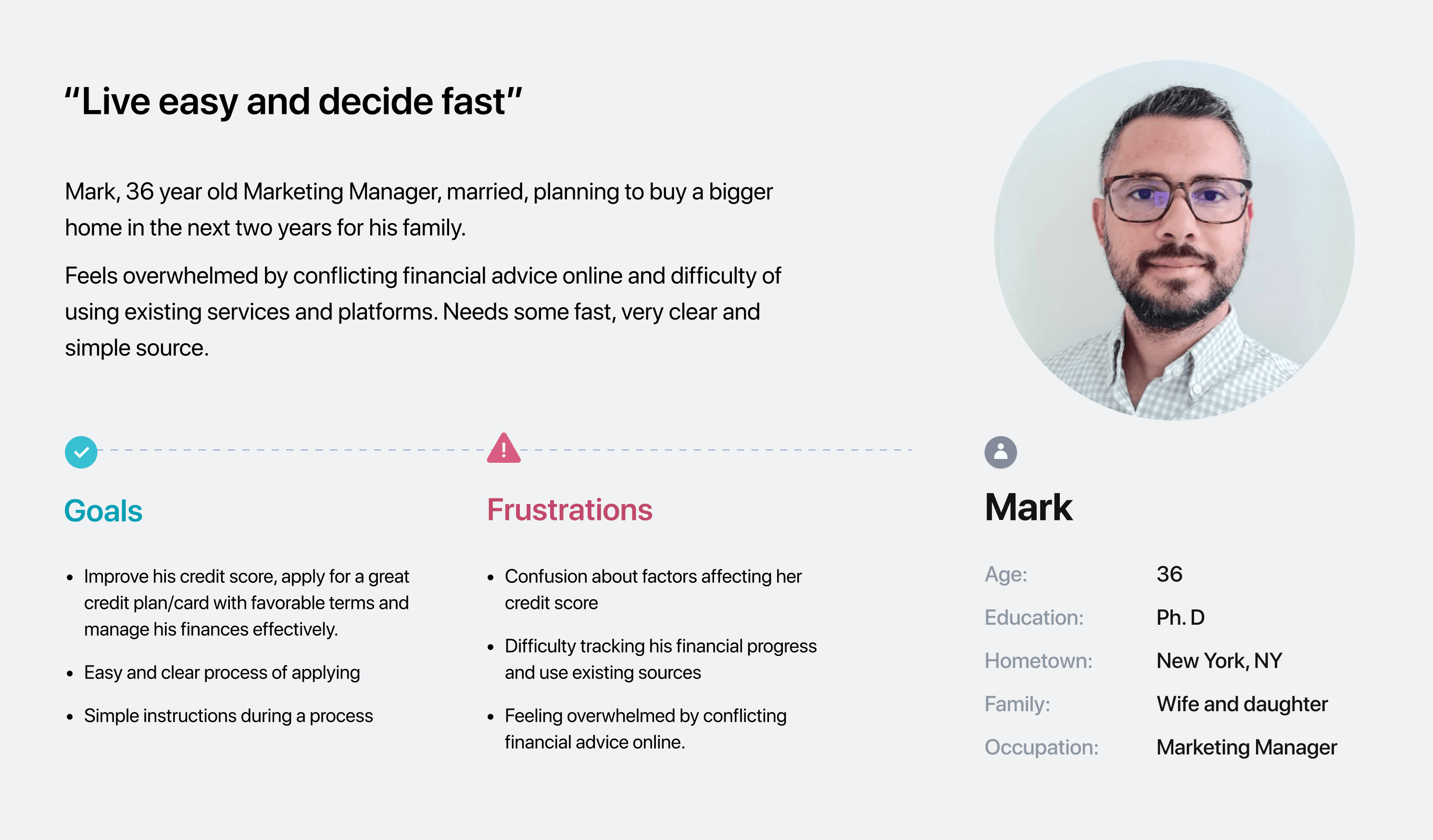
Personas were selected by conducting user research and identifying common pain points, that frustrate and block the user from getting what they need from a product.
Personas were selected by conducting user research and identifying common pain points, that frustrate and block the user from getting what they need from a product.
Personas were selected by conducting user research and identifying common pain points, that frustrate and block the user from getting what they need from a product.
Personas were selected by conducting user research and identifying common pain points, that frustrate and block the user from getting what they need from a product.



User journey map
User journey map
User journey map
User journey map
User journey map
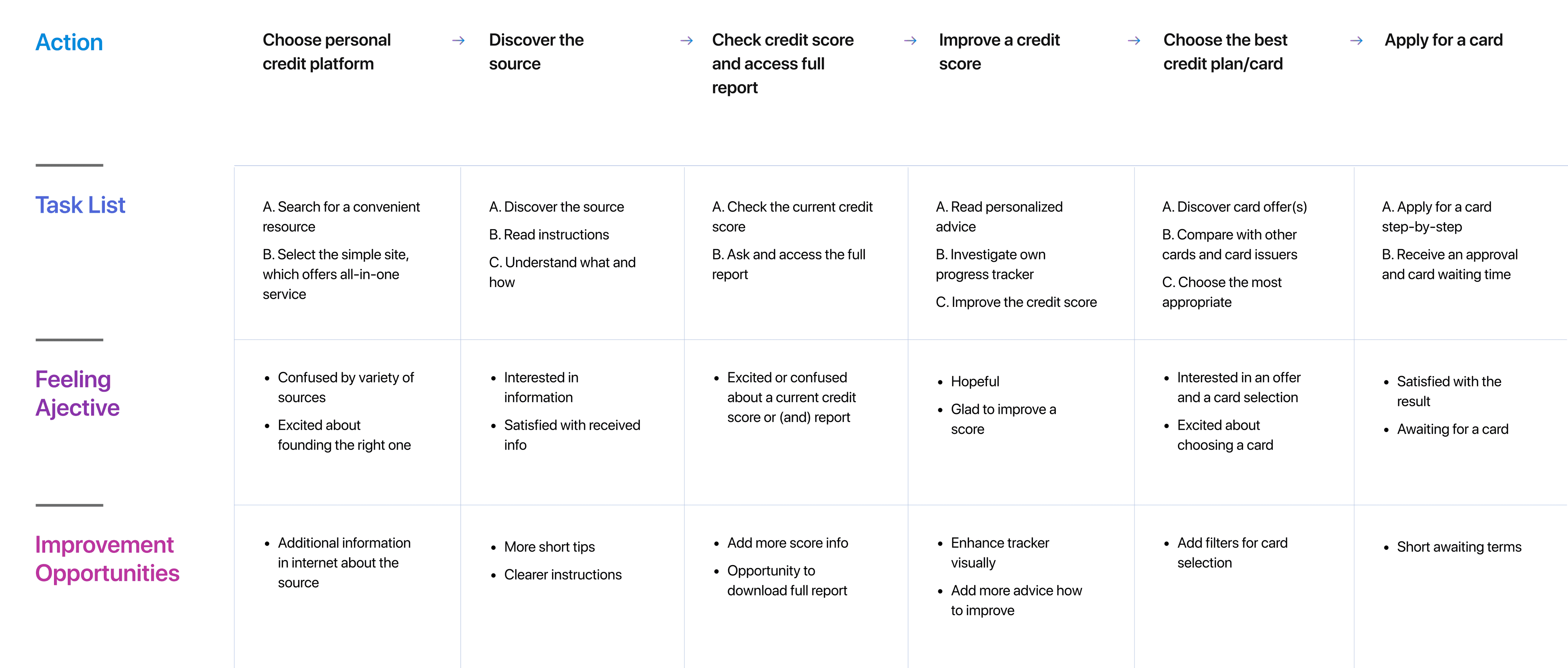
It is the series of experiences Mark has as he achieve a specific goal. It was built on the his experience.
It is the series of experiences Mark has as he achieve a specific goal. It was built on the his experience.
It is the series of experiences Mark has as he achieve a specific goal. It was built on the his experience.
It is the series of experiences Mark has as he achieve a specific goal. It was built on the his experience.
I developed a user journey map of Mark's experience with the site to pinpoint potential pain points and identify areas for improvement.
I developed a user journey map of Mark's experience with the site to pinpoint potential pain points and identify areas for improvement.
I developed a user journey map of Mark's experience with the site to pinpoint potential pain points and identify areas for improvement.
I developed a user journey map of Mark's experience with the site to pinpoint potential pain points and identify areas for improvement.
Goal:
Check and improve credit score, apply for an appropriate credit plan and related credit card.
Goal:
Check and improve credit score, apply for an appropriate credit plan and related credit card.
Goal:
Check and improve credit score, apply for an appropriate credit plan and related credit card.
Goal:
Check and improve credit score, apply for an appropriate credit plan and related credit card.


the project schematically :
the project schematically :
the project schematically :
the project schematically :
the project schematically :
Starting the design
Starting the design
Starting the design
Starting the design
Starting the design
I created various diagrams and storyboards to clarify and analyze the app's information and architecture. Afterward, I sketched paper wireframes and then transitioned to digital wireframes, building a low-fidelity prototype to conduct initial usability studies with stakeholders.
I created various diagrams and storyboards to clarify and analyze the app's information and architecture. Afterward, I sketched paper wireframes and then transitioned to digital wireframes, building a low-fidelity prototype to conduct initial usability studies with stakeholders.
I created various diagrams and storyboards to clarify and analyze the app's information and architecture. Afterward, I sketched paper wireframes and then transitioned to digital wireframes, building a low-fidelity prototype to conduct initial usability studies with stakeholders.
Here I built some schemes and storyboards to clarify and understand information and architecture of the app. After I created paper wireframes and than proceeded with building digital wireframes with a low-fidelity prototype in order to conduct usability studies with stakeholders.
I created various diagrams and storyboards to clarify and analyze the app's information and architecture. Afterward, I sketched paper wireframes and then transitioned to digital wireframes, building a low-fidelity prototype to conduct initial usability studies with stakeholders.
Sitemap
Sitemap
Sitemap
Sitemap
Sitemap
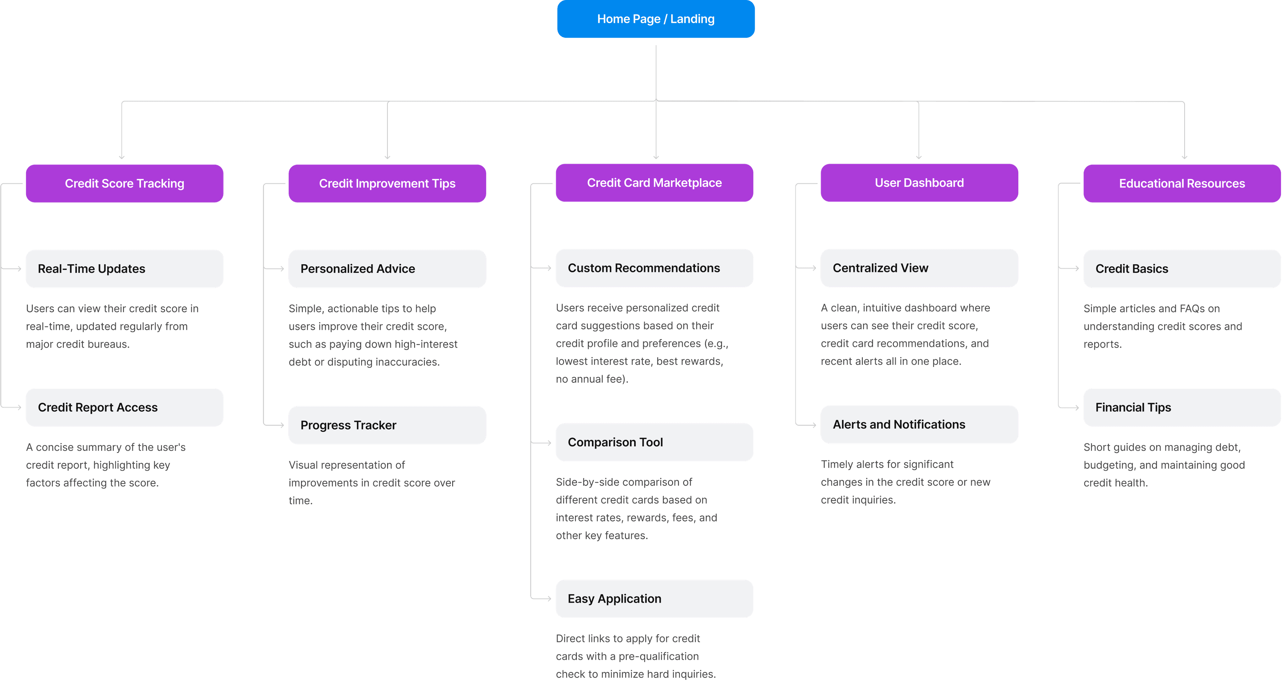
It's a structured scheme that outlines the pages and content hierarchy of the website.
It's a structured scheme that outlines the pages and content hierarchy of the website.
It's a structured scheme that outlines the pages and content hierarchy of the website.
It's a structured scheme that outlines the pages and content hierarchy of the website.
Next step: creating the website map. Initially structure of the project was more complicated, and contained more services, sections etc. But the goal was to make it as simple as possible, and at the same time with all the info.
Next step: creating the website map. Initially structure of the project was more complicated, and contained more services, sections etc. But the goal was to make it as simple as possible, and at the same time with all the info.
Next step: creating the website map. Initially structure of the project was more complicated, and contained more services, sections etc. But the goal was to make it as simple as possible, and at the same time with all the info.
Next step: creating the website map. Initially structure of the project was more complicated, and contained more services, sections etc. But the goal was to make it as simple as possible, and at the same time with all the info.


Paper wireframes
Paper wireframes
Paper wireframes
Paper wireframes
Paper wireframes
They initially oriented on the basic structure of the homepage and highlight the intended function of each element.
They initially oriented on the basic structure of the homepage and highlight the intended function of each element.
They initially oriented on the basic structure of the homepage and highlight the intended function of each element.
They initially oriented on the basic structure of the homepage and highlight the intended function of each element.
I sketched several different layouts for how the homepage's information structure could appear. After reviewing all the versions, I merged them into a refined design. Additionally, since Credroad customers access the site on various devices, I began working on designs for different screen sizes to ensure the site is fully responsive.
The goal was to explore different ideas with wireframes.


Digital wireframes
Digital wireframes
Digital wireframes
Digital wireframes
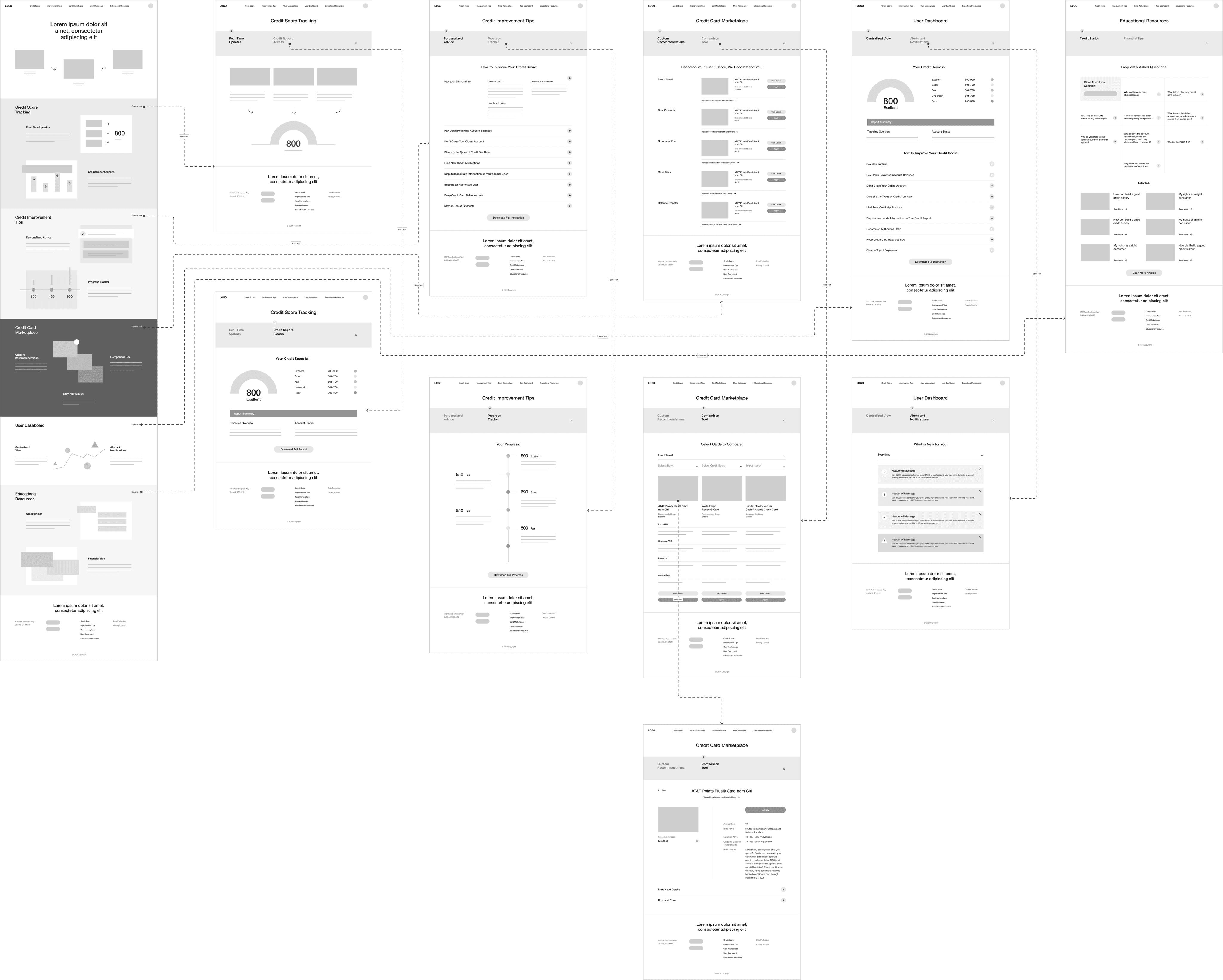
More "clear" version of wireframes in a digital form. Also all the important pages are added
in it.
More "clear" version of wireframes in a digital form. Also all the important pages are added
in it.
More "clear" version of wireframes in a digital form. Also all the important pages are added in it.
On this step I used the Figma design tool to create digital wireframes of all the pages. Then I bonded all of them into the clear and smooth structure.
The goal is to show how all the pages and things interact with each other.
On this step I used the Figma design tool to create digital wireframes of all the pages. Then I bonded all of them into the clear and smooth structure.
The goal is to show how all the pages and things interact with each other.
On this step I used the Figma design tool to create digital wireframes of all the pages. Then I bonded all of them into the clear and smooth structure.
The goal is to show how all the pages and things interact with each other.


about the project :
about the project :
M
Digital wireframes
More "clear" version of wireframes in a digital form. Also all the important pages are added
in it.
On this step I used the Figma design tool to create digital wireframes of all the pages. Then I bonded all of them into the clear and smooth structure.
The goal is to show how all the pages and things interact with each other.

about the project :
M
Low-fidelity prototype
Low-fidelity prototype
Low-fidelity prototype
Low-fidelity prototype
Low-fidelity prototype
It's a simple interactive model that provides a basic idea of what the product would look like.
It's a simple interactive model that provides a basic idea of what the product would look like.
It's a simple interactive model that provides a basic idea of what the product would look like.
More "clear" version of wireframes in a digital form. Also all the important pages are added in it.
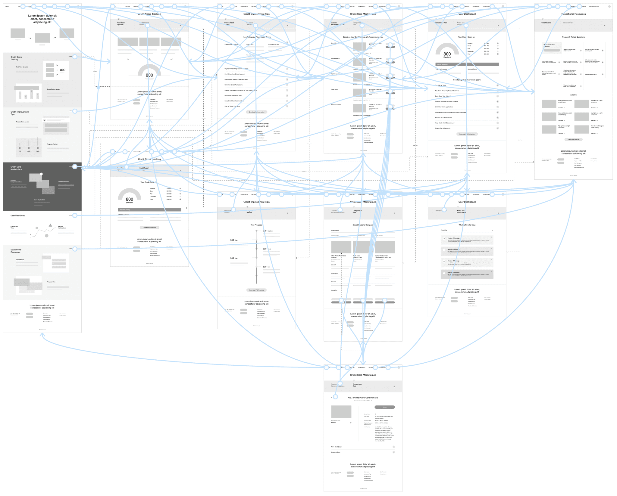
To create a low-fidelity prototype, I connected all of the screens for showing user experience throw the website.
The goal is to receive feedback on my designs from members of my team about page construction and most important zones, and then implement their suggestions.
To create a low-fidelity prototype, I connected all of the screens for showing user experience throw the website.
The goal is to receive feedback on my designs from members of my team about page construction and most important zones, and then implement their suggestions.
To create a low-fidelity prototype, I connected all of the screens for showing user experience throw the website.
The goal is to receive feedback on my designs from members of my team about page construction and most important zones, and then implement their suggestions.
To create a low-fidelity prototype, I connected all of the screens for showing user experience throw the website.
The goal is to receive feedback on my designs from members of my team about page construction and most important zones, and then implement their suggestions.


Usability studies
Usability studies
Usability studies
Usability studies
Usability studies
This is an examination of users and their needs, which adds realistic context to the design process.
This is an examination of users and their needs, which adds realistic context to the design process.
This is an examination of users and their needs, which adds realistic context to the design process.
This is an examination of users and their needs, which adds
realistic context to the design process.
This is an examination of users and their needs, which adds realistic context to the design process.
Initially, I conducted unmoderated usability studies with several participants, who answered various questions about the site and shared their observations while interacting with the low-fidelity prototype. After gathering the data, I analyzed and synthesized the information. Ultimately, I identified key themes and generated several insights.
The goal was to identify pain points that the user experiences with the app designs so the issues can be fixed before the final product launches.
Credit score:
Credit score:
Credit score:
Credit score:
Credit score:
Make the credit score image more understandable visually, add bureaus description.
Make the credit score image more understandable visually, add bureaus description.
Make the credit score image more understandable visually, add bureaus description.
Make the credit score image more understandable visually, add bureaus description.
Card comparison:
Card comparison:
Card comparison:
Card comparison:
Card comparison:
There is no clear way how to add cards to comparison, or remove them.
There is no clear way how to add cards to comparison, or remove them.
There is no clear way how to add cards to comparison, or remove them.
There is no clear way how to add cards to comparison, or remove them.
User dashboard:
User dashboard:
User dashboard:
User dashboard:
User dashboard:
On the dashboard user don’t have an information how to improve his credit score, it’s great to have all the things here.
On the dashboard user don’t have an information how to improve his credit score, it’s great to have all the things here.
On the dashboard user don’t have an information how to improve his credit score, it’s great to have all the things here.
On the dashboard user don’t have an information how to improve his credit score, it’s great to have all the things here.
the clear version :
the clear version :
the clear version :
the clear version :
the clear version :
Refining design
Refining design
Refining design
Refining design
Refining design
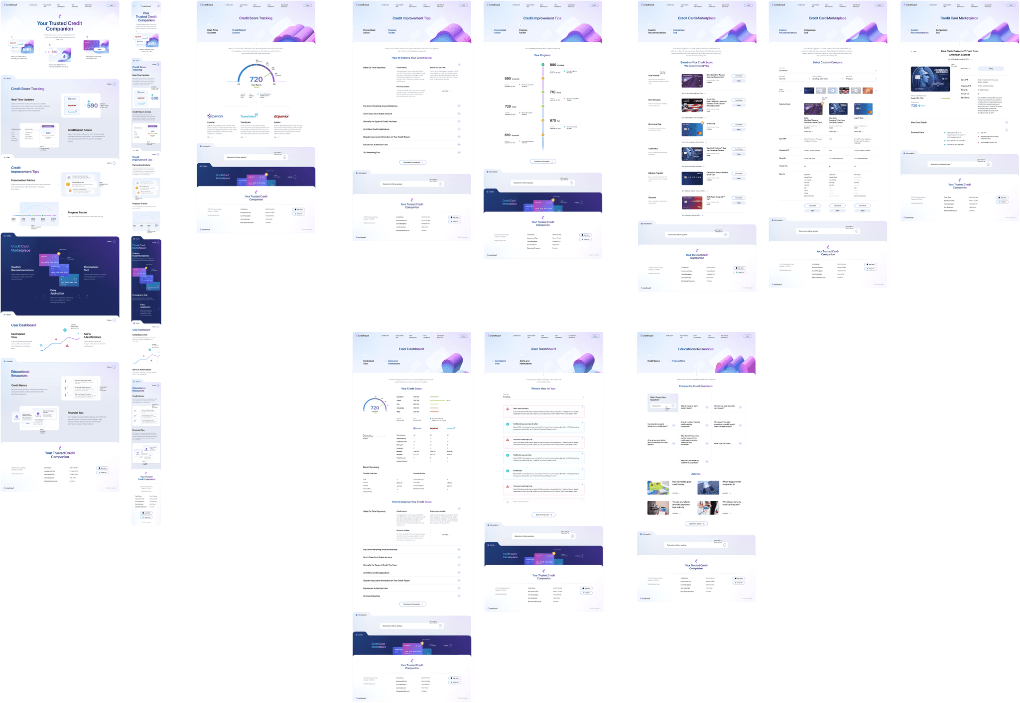
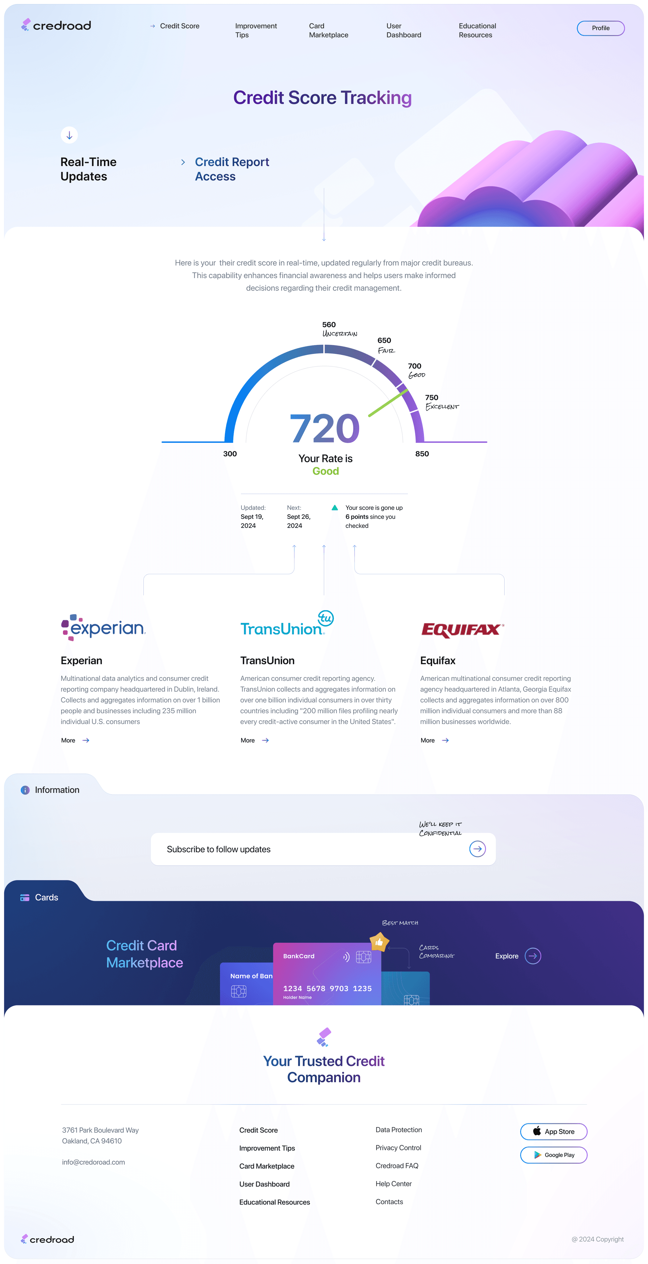
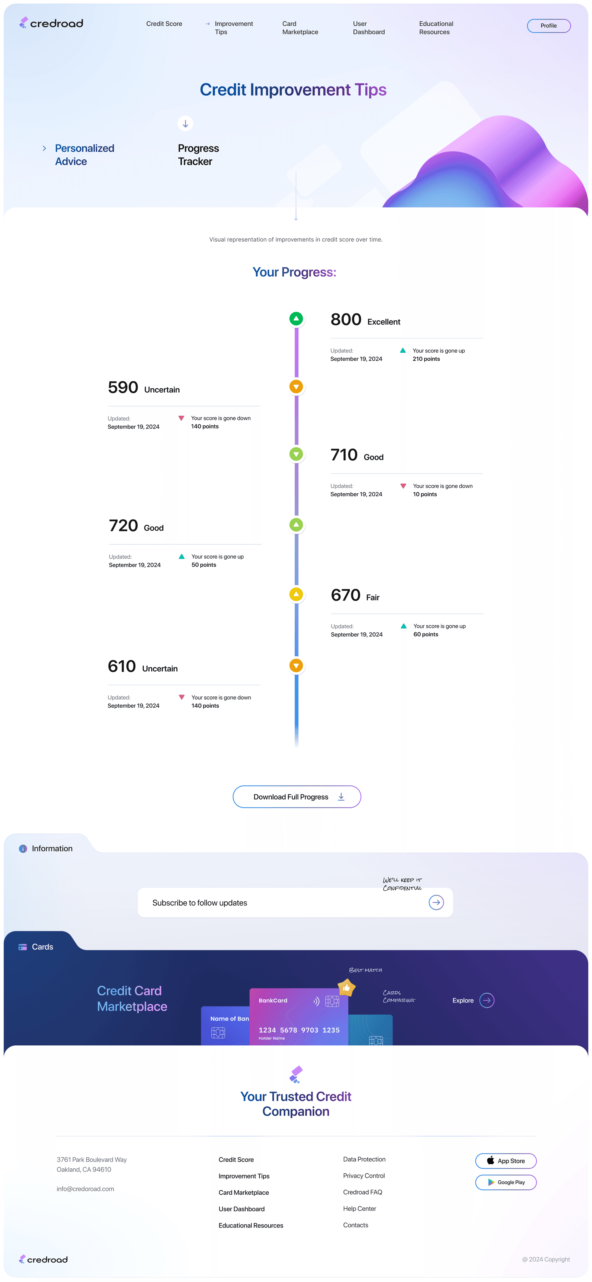
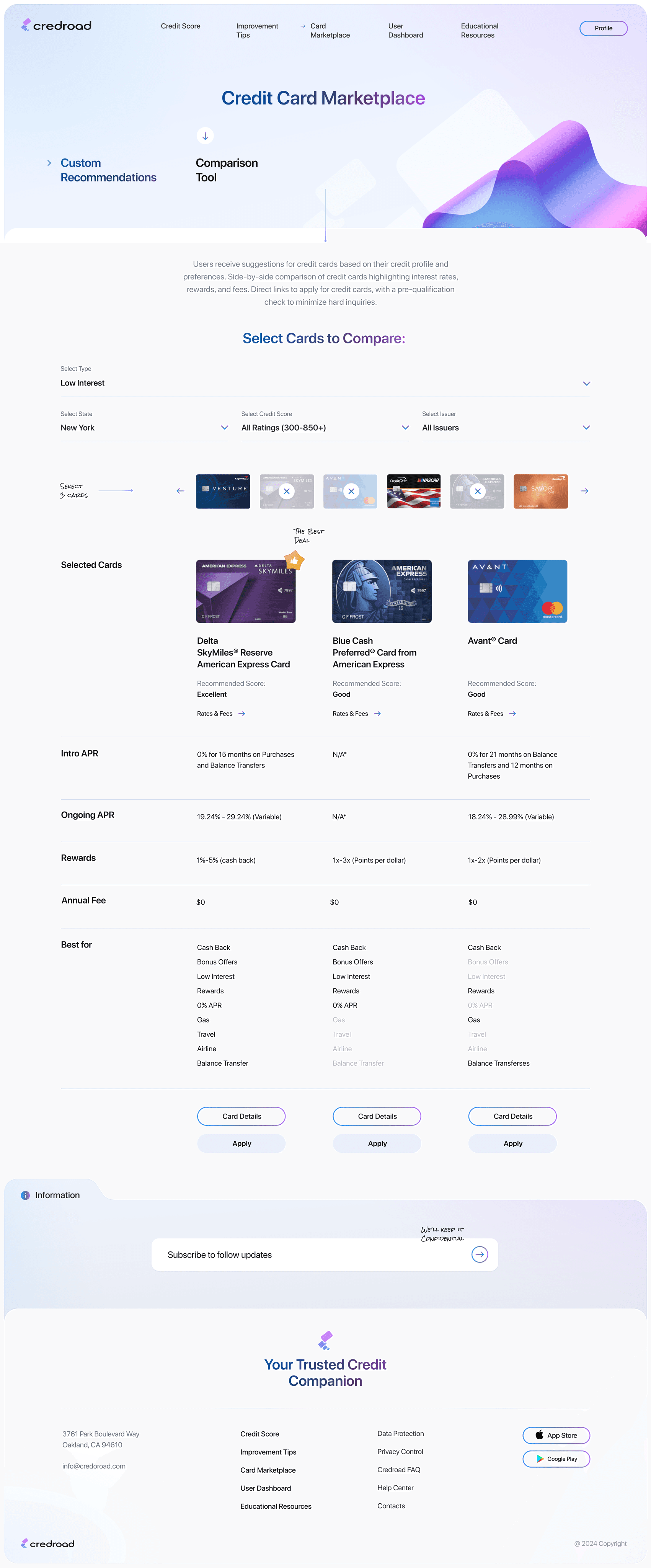
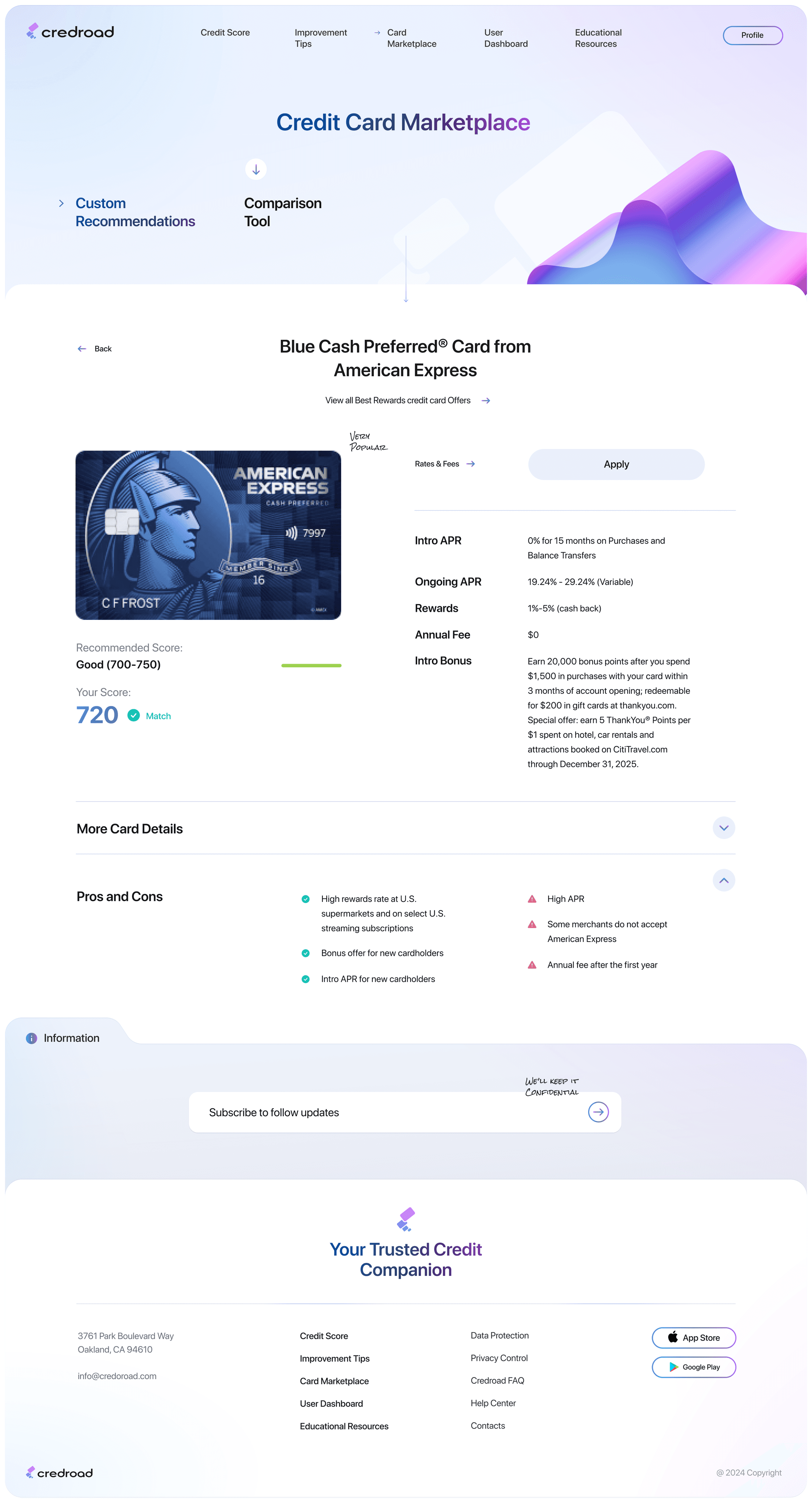
On this step, first I created a static, high-fidelity Credroad website design (keeping in mind all the conclusions from the previous phase of usability studies) that is a clear representation of a final product called design mockups.
On this step, first I created a static, high-fidelity Credroad website design (keeping in mind all the conclusions from the previous phase of usability studies) that is a clear representation of a final product called design mockups.
On this step, first I created a static, high-fidelity Credroad website design (keeping in mind all the conclusions from the previous phase of usability studies) that is a clear representation of a final product called design mockups.
On this step, first I created a static, high-fidelity Credroad website design (keeping in mind all the conclusions from the previous phase of usability studies) that is a clear representation of a final product called design mockups.
Mockups
Mockups
Mockups
Mockups
Mockups
These are a high fidelity design that represents a final product
These are a high fidelity design that represents a final product
These are a high fidelity design that represents a final product
These are a high fidelity design that represents a final product
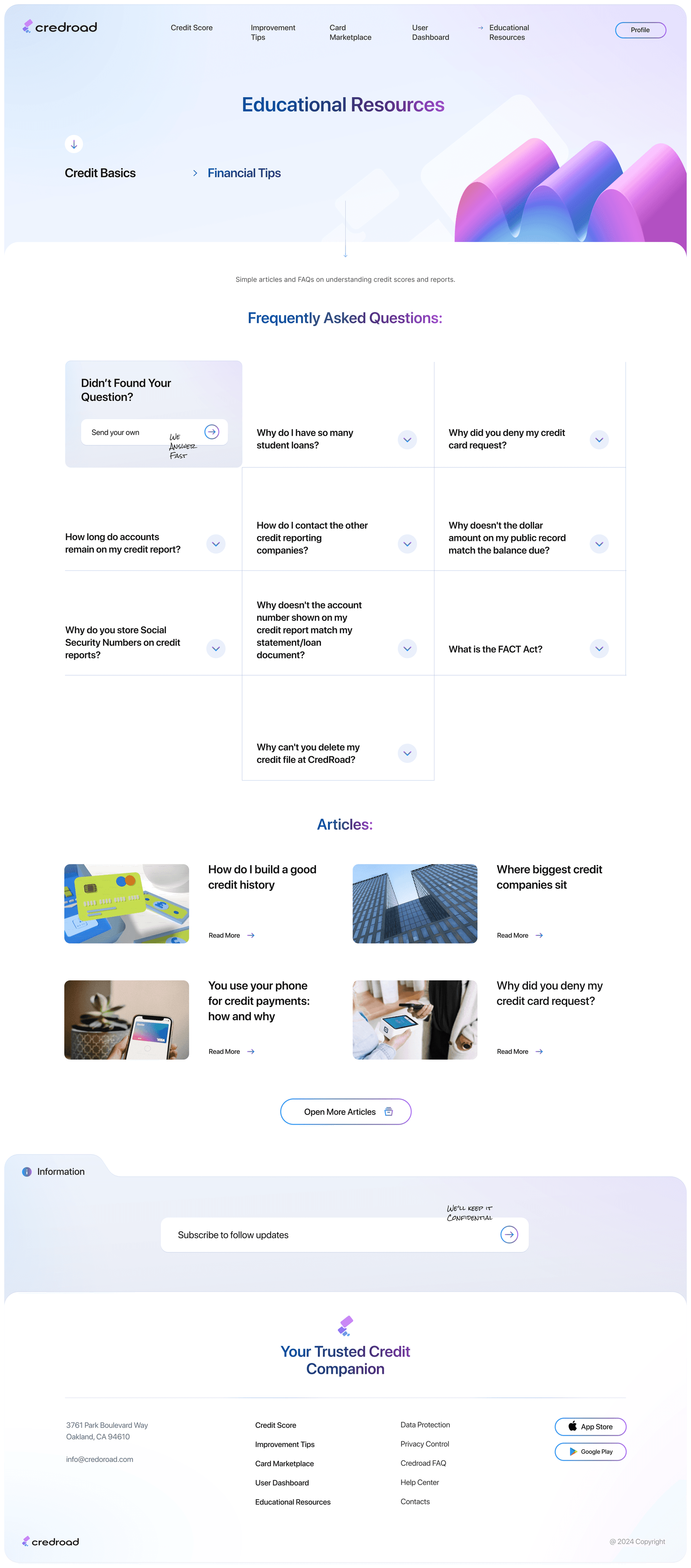
I created all the website pages mockups, incorporating the right design elements such as typography, color, and iconography. I also included captivating and visually appealing images, and developed all the necessary components and elements.
The goal was to demonstrate the final Credroad website in as much detail as possible.












looking forward :
looking forward :
looking forward :
looking forward :
looking forward :
Outcome
Outcome
Outcome
Outcome
Now, finally, it remained to pay attention to several takeaways and plan some further steps.
Now, finally, it remained to pay attention to several takeaways and plan some further steps.
Now, finally, it remained to pay attention to several takeaways and plan some further steps.
Now, finally, it remained to pay attention to several takeaways and plan some further steps.
Takeaways
Takeaways
Takeaways
Takeaways
Takeaways
Impact:
Impact:
Impact:
Impact:
Impact:
Our target users have described Credroad's design as intuitive and user-friendly, allowing them to easily check and improve their credit scores, find all necessary information, and choose the most suitable credit plan.
Our target users have described Credroad's design as intuitive and user-friendly, allowing them to easily check and improve their credit scores, find all necessary information, and choose the most suitable credit plan.
Our target users have described Credroad's design as intuitive and user-friendly, allowing them to easily check and improve their credit scores, find all necessary information, and choose the most suitable credit plan.
Our target users have described Credroad's design as intuitive and user-friendly, allowing them to easily check and improve their credit scores, find all necessary information, and choose the most suitable credit plan.
What I learned:
What I learned:
What I learned:
What I learned:
What I learned:
The main thing I learned that even a small change can have a huge impact on the user experience. The most important takeaway for me is to always focus on the real needs of the user.
The main thing I learned that even a small change can have a huge impact on the user experience. The most important takeaway for me is to always focus on the real needs of the user.
The main thing I learned that even a small change can have a huge impact on the user experience. The most important takeaway for me is to always focus on the real needs of the user.
The main thing I learned that even a small change can have a huge impact on the user experience. The most important takeaway for me is to always focus on the real needs of the user.
Next steps
Next steps
Next steps
Next steps
Next steps
Identify any additional areas of need and ideate on new features.
Conduct follow-up usability testing on the new app iteration
Conduct follow-up usability testing on the new app iteration
Conduct follow-up usability testing on the new app
iteration.
Conduct follow-up usability testing on the new app iteration
Conduct follow-up usability testing on the new website.
Conduct follow-up usability testing on the new website.
Conduct follow-up usability testing on the new website.
Identify any additional areas of need and ideate on new
features.
Conduct follow-up usability testing on the new website.
To get in touch :
To get in touch
To get in touch :
To get in touch :
To get in touch :
Connect
Connect
Connect
Connect
Connect
Let me help with a great visual solution for your business.
Let me help with a great visual solution for your business.
Let me help with a great visual solution for your business.
Let me help with a great visual solution for your business.
Let me help with a great visual solution for your business.
Click to copy :
Click to copy
Click to copy :
Click to copy :
Click to copy :


Works
Overview
Research
Wireframes
Design
Outcome
Overview
Research
Wireframes
Design
Outcome
Works
Works
Overview
Research
Wireframes
Design
Outcome