

Placever
Placever
Placever
Placever
Region
Region
EU
EU
Year
Year
2023
2023
Year
2023
Region
EU
Region
EU
Year
2023
Placever
Voo's Cinema
Voo's Cinema
Voo's Cinema


the project itself :
the project itself :
the project itself :
the project itself :
the project itself :
Project Overview
Project Overview
Project Overview
Project Overview
Project Overview
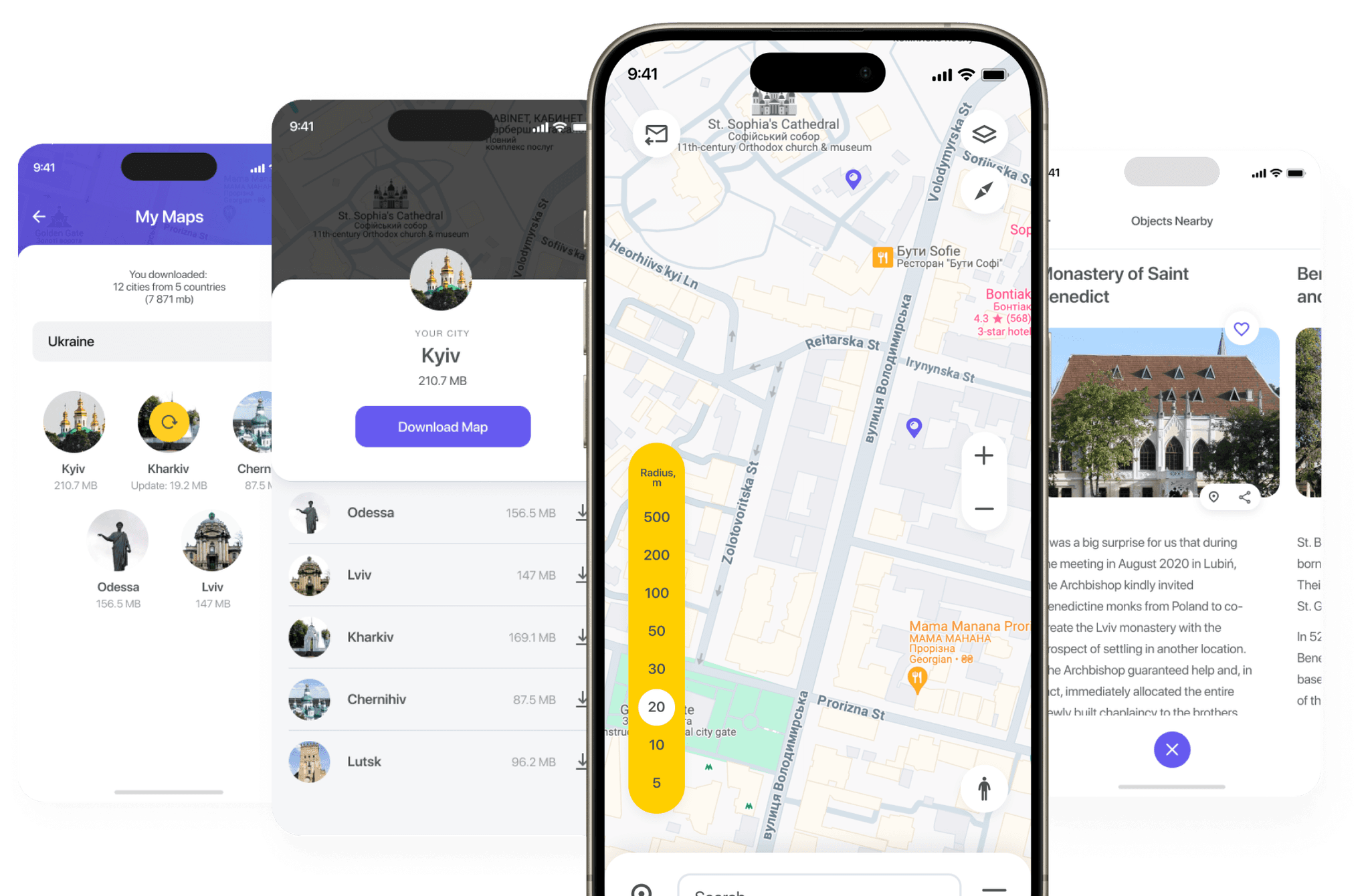
Placever is a startup project centered around a mobile application with the core concept of "Discoveries During a Walk." This allows users to explore their surroundings and learn about the city as they stroll. The main objective is to provide users with easy access to information, enabling them to discover everything about a location or object.
Placever is a startup project centered around a mobile application with the core concept of "Discoveries During a Walk." This allows users to explore their surroundings and learn about the city as they stroll. The main objective is to provide users with easy access to information, enabling them to discover everything about a location or object.
Placever is a startup project centered around a mobile application with the core concept of "Discoveries During a Walk." This allows users to explore their surroundings and learn about the city as they stroll. The main objective is to provide users with easy access to information, enabling them to discover everything about a location or object.
Placever is a startup project centered around a mobile application with the core concept of "Discoveries During a Walk." This allows users to explore their surroundings and learn about the city as they stroll. The main objective is to provide users with easy access to information, enabling them to discover everything about a location or object.
Problem:
Problem:
Problem:
Problem:
Problem:
Most map-based projects require constant interaction with the app, which can be interesting yet stressful for the average traveler when searching for information. Many people simply want to know where to go and follow the map without additional distractions.
Most map-based projects require constant interaction with the app, which can be interesting yet stressful for the average traveler when searching for information. Many people simply want to know where to go and follow the map without additional distractions.
Most map-based projects require constant interaction with the app, which can be interesting yet stressful for the average traveler when searching for information. Many people simply want to know where to go and follow the map without additional distractions.
Most map-based projects require constant interaction with the app, which can be interesting yet stressful for the average traveler when searching for information. Many people simply want to know where to go and follow the map without additional distractions.
Goal:
Goal:
Goal:
Goal:
Goal:
Design an application that enables users to effortlessly explore the city while receiving information without needing to take any action; the app should automatically display everything on its own.
Design an application that enables users to effortlessly explore the city while receiving information without needing to take any action; the app should automatically display everything on its own.
Design an application that enables users to effortlessly explore the city while receiving information without needing to take any action; the app should automatically display everything on its own.
Design an application that enables users to effortlessly explore the city while receiving information without needing to take any action; the app should automatically display everything on its own.
My role:
My role:
My role:
My role:
My role:
UX designer leading the Placever mobile application design.
UX designer leading the Placever mobile application design.
UX designer leading the Placever mobile application design.
UX designer leading the Placever mobile application design.
Responsibilities:
Responsibilities:
Responsibilities:
Responsibilities:
Responsibilities:
conducting research,
storyboarding,
paper and digital wireframing,
conducting research,
storyboarding,
paper and digital wireframing,
conducting research,
storyboarding,
paper and digital wireframing,
conducting research,
storyboarding,
paper and digital wireframing,
usability studies,
iterating on designs,
making high-fidelity prototype
usability studies,
iterating on designs,
making high-fidelity prototype
usability studies,
iterating on designs,
making high-fidelity prototype
usability studies,
iterating on designs,
making high-fidelity prototype
all about the user :
all about the user :
all about the user :
all about the user :
all about the user :
User research
User research
User research
User research
User research
I conducted user interviews with several city travel enthusiasts to understand their preferences for exploring new places, discovering city attractions, and using travel mobile applications in general. The insights revealed their preference for a calm, exploratory travel style, which guided me in designing an app that prioritizes convenience and enhances user satisfaction.
I conducted user interviews with several city travel enthusiasts to understand their preferences for exploring new places, discovering city attractions, and using travel mobile applications in general. The insights revealed their preference for a calm, exploratory travel style, which guided me in designing an app that prioritizes convenience and enhances user satisfaction.
I conducted user interviews with several city travel enthusiasts to understand their preferences for exploring new places, discovering city attractions, and using travel mobile applications in general. The insights revealed their preference for a calm, exploratory travel style, which guided me in designing an app that prioritizes convenience and enhances user satisfaction.
I conducted user interviews with several city travel enthusiasts to understand their preferences for exploring new places, discovering city attractions, and using travel mobile applications in general. The insights revealed their preference for a calm, exploratory travel style, which guided me in designing an app that prioritizes convenience and enhances user satisfaction.
Pain points
Pain points
Pain points
Pain points
Pain points
Routs approaching:
Routs approaching:
Routs approaching:
Routs approaching:
Routs approaching:
Most applications are focused on building routes, when this is often not necessary.
Most applications are focused on building routes, when this is often not necessary.
Most applications are focused on building routes, when this is often not necessary.
Most applications are focused on building routes, when this is often not necessary.
You need to find all:
You need to find all:
You need to find all:
You need to find all:
You need to find all:
You always have to look for everything: the place where you are, the sights nearby.
You always have to look for everything: the place where you are, the sights nearby.
You always have to look for everything: the place where you are, the sights nearby.
You always have to look for everything: the place where you are, the sights nearby.
Little information:
Little information:
Little information:
Little information:
Little information:
Information about places is often brief and wiki-based, you have to google it and find out more.
Information about places is often brief and wiki-based, you have to google it and find out more.
Information about places is often brief and wiki-based, you have to google it and find out more.
Information about places is often brief and wiki-based, you have to google it and find out more.
User personas
User personas
User personas
User personas
User personas
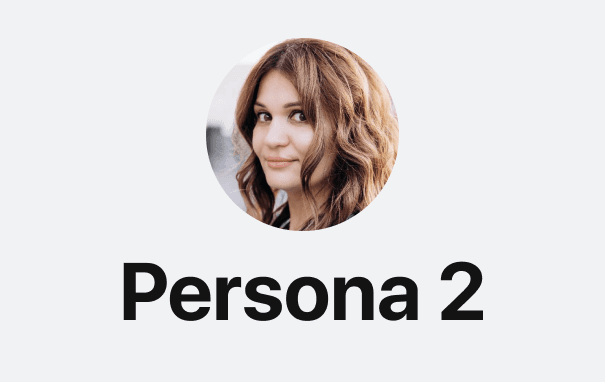
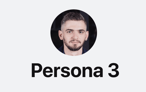
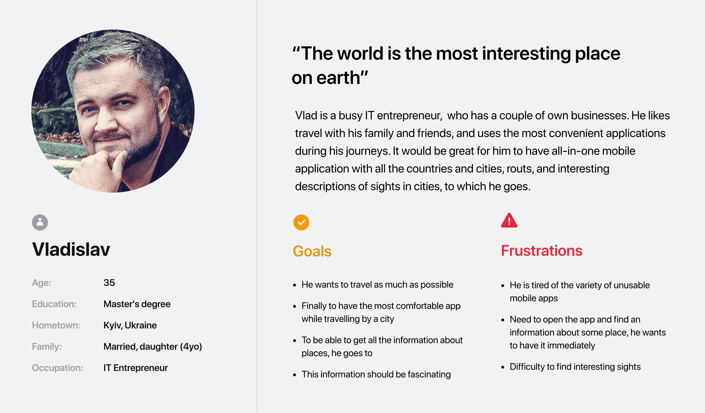
Personas were selected by conducting user research and identifying common pain points, that frustrate and block the user from getting what they need from a product.
Personas were selected by conducting user research and identifying common pain points, that frustrate and block the user from getting what they need from a product.
Personas were selected by conducting user research and identifying common pain points, that frustrate and block the user from getting what they need from a product.
Personas were selected by conducting user research and identifying common pain points, that frustrate and block the user from getting what they need from a product.





User journey map
User journey map
User journey map
User journey map
User journey map
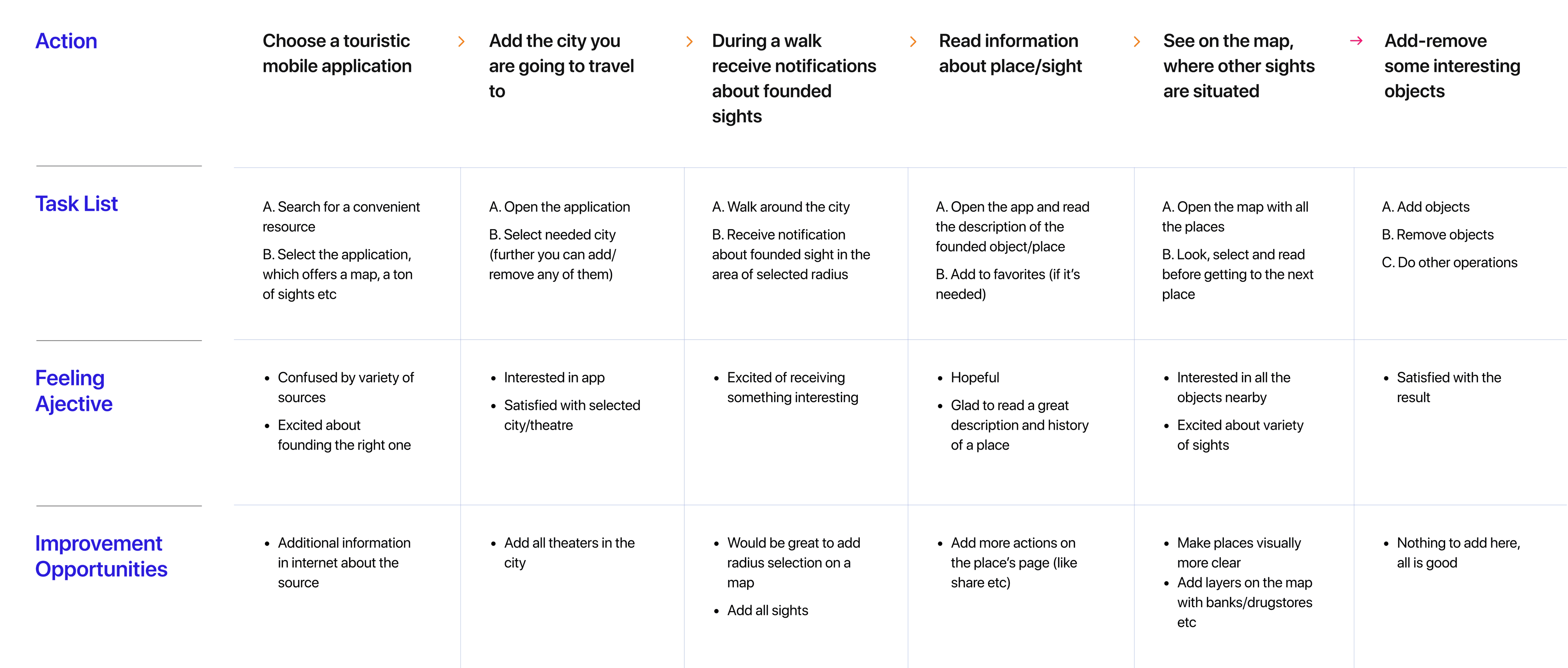
It is the series of experiences Vlad has as he achieve a specific goal. It was built on the his experience.
It is the series of experiences Vlad has as he achieve a specific goal. It was built on the his experience.
It is the series of experiences Vlad has as he achieve a specific goal. It was built on the his experience.
It is the series of experiences Vlad has as he achieve a specific goal. It was built on the his experience.
I developed a user journey map of Vlad's experience with the app to identify potential pain points and areas for improvement.
I developed a user journey map of Vlad's experience with the app to identify potential pain points and areas for improvement.
I developed a user journey map of Vlad's experience with the app to identify potential pain points and areas for improvement.
I developed a user journey map of Vlad's experience with the app to identify potential pain points and areas for improvement.
Goal:
To explore city attractions without constantly looking at a map and receive engaging descriptions of each location.
Goal:
To explore city attractions without constantly looking at a map and receive engaging descriptions of each location.
Goal:
To explore city attractions without constantly looking at a map and receive engaging descriptions of each location.
Goal:
To explore city attractions without constantly looking at a map and receive engaging descriptions of each location.


the project schematically :
the project schematically :
the project schematically :
the project schematically :
the project schematically :
Starting the design
Starting the design
Starting the design
Starting the design
Starting the design
Here I built some schemes and storyboards to clarify and understand information and architecture of the app. After I created paper wireframes and than proceeded with building digital wireframes with a low-fidelity prototype in order to conduct first usability studies with stakeholders.
Here I built some schemes and storyboards to clarify and understand information and architecture of the app. After I created paper wireframes and than proceeded with building digital wireframes with a low-fidelity prototype in order to conduct first usability studies with stakeholders.
Here I built some schemes and storyboards to clarify and understand information and architecture of the app. After I created paper wireframes and than proceeded with building digital wireframes with a low-fidelity prototype in order to conduct first usability studies with stakeholders.
Here I built some schemes and storyboards to clarify and understand information and architecture of the app. After I created paper wireframes and than proceeded with building digital wireframes with a low-fidelity prototype in order to conduct first usability studies with stakeholders.
Here I built some schemes and storyboards to clarify and understand information and architecture of the app. After I created paper wireframes and than proceeded with building digital wireframes with a low-fidelity prototype in order to conduct usability studies with stakeholders.
Appmap
Appmap
Appmap
Appmap
Appmap
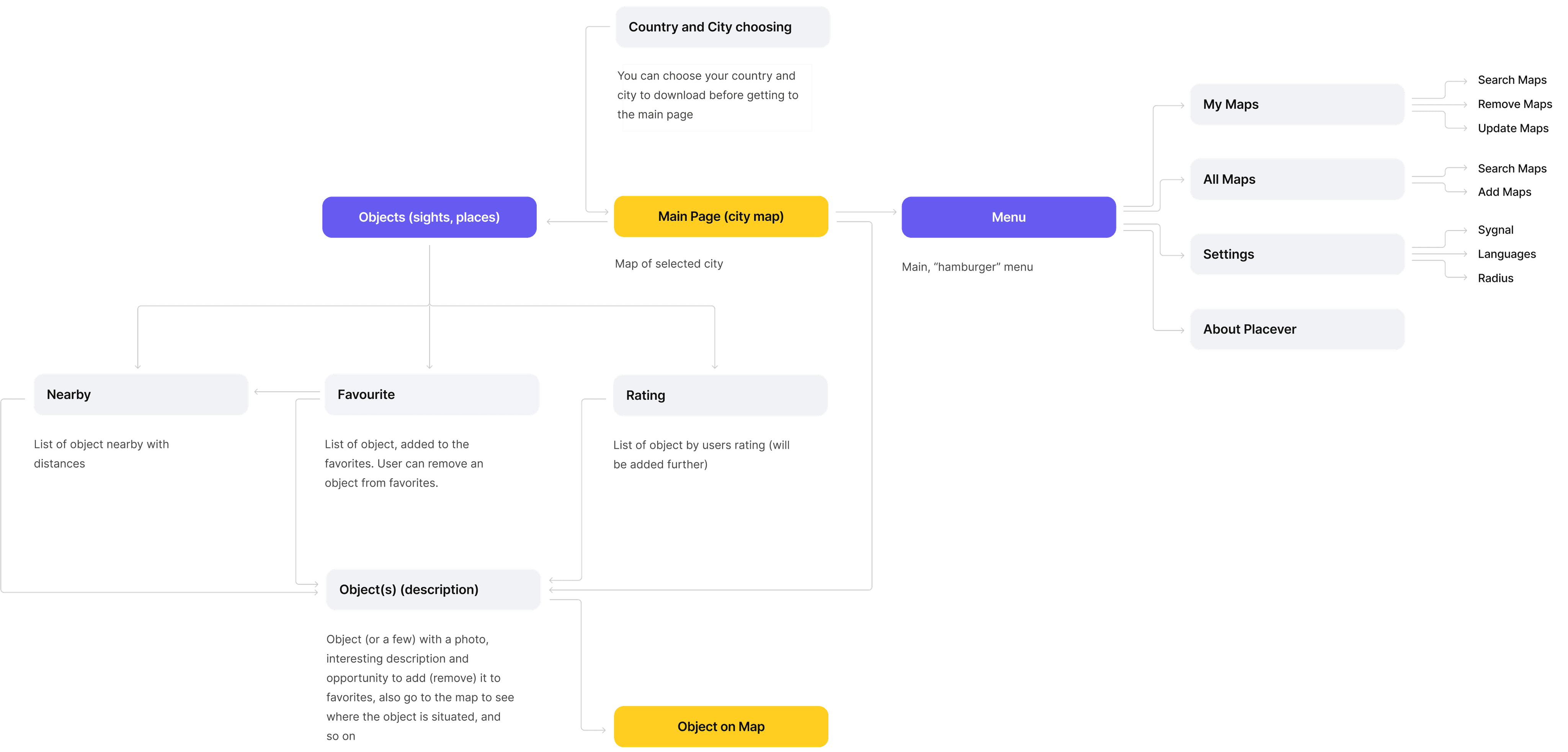
It's a structured scheme that outlines the pages and content hierarchy of the app.
It's a structured scheme that outlines the pages and content hierarchy of the app.
It's a structured scheme that outlines the pages and content hierarchy of the app.
It's a structured scheme that outlines the pages and content hierarchy of the app.
Next step: creating the application map. My goal here was to make strategic information architecture decisions that would improve overall app navigation. The structure I chose was designed to make things simple and easy.
Next step: creating the application map. My goal here was to make strategic information architecture decisions that would improve overall app navigation. The structure I chose was designed to make things simple and easy.
Next step: creating the application map. My goal here was to make strategic information architecture decisions that would improve overall app navigation. The structure I chose was designed to make things simple and easy.
Next step: creating the application map. My goal here was to make strategic information architecture decisions that would improve overall app navigation. The structure I chose was designed to make things simple and easy.


Paper wireframes
Paper wireframes
Paper wireframes
Paper wireframes
Paper wireframes
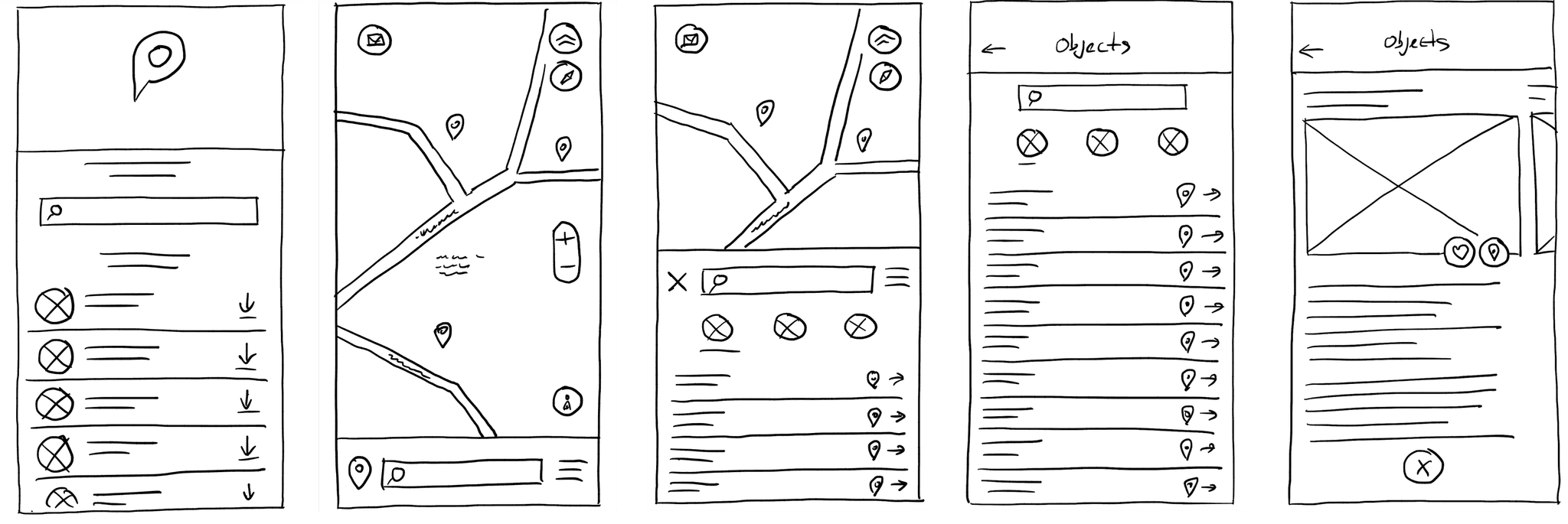
They initially oriented on the basic structure of the homepage and highlight the intended function of each element.
They initially oriented on the basic structure of the homepage and highlight the intended function of each element.
They initially oriented on the basic structure of the homepage and highlight the intended function of each element.
They initially oriented on the basic structure of the homepage and highlight the intended function of each element.
Here I drew the most important pages of the Placever app – list of cities to choose, map of selected city, list of sights, page of a sight and so on.
The goal was to explore different ideas with wireframes.
Here I drew the most important pages of the Placever app – list of cities to choose, map of selected city, list of sights, page of a sight and so on.
The goal was to explore different ideas with wireframes.
Here I drew the most important pages of the Placever app – list of cities to choose, map of selected city, list of sights, page of a sight and so on.
The goal was to explore different ideas with wireframes.
Here I drew the most important pages of the Placever app – list of cities to choose, map of selected city, list of sights, page of a sight and so on.
The goal was to explore different ideas with wireframes.


Digital wireframes
Digital wireframes
Digital wireframes
Digital wireframes
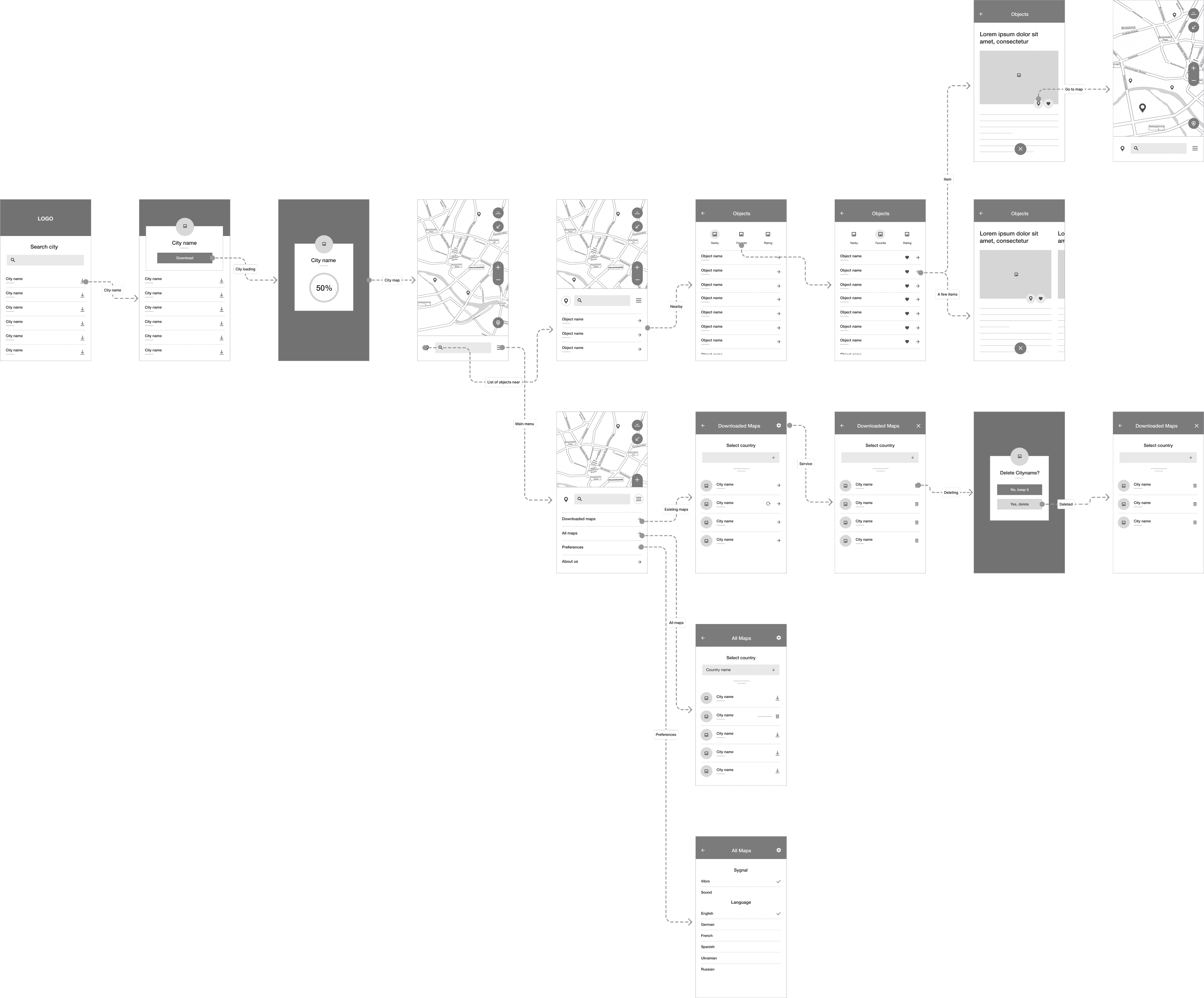
More "clear" version of wireframes in a digital form. Also all the important pages are added
in it.
More "clear" version of wireframes in a digital form. Also all the important pages are added
in it.
More "clear" version of wireframes in a digital form. Also all the important pages are added in it.
On this step I used the Figma design tool to create digital wireframes of all the pages. Then I bonded all of them into the clear and smooth structure.
The goal is to show how all the pages and things interact with each other.
On this step I used the Figma design tool to create digital wireframes of all the pages. Then I bonded all of them into the clear and smooth structure.
The goal is to show how all the pages and things interact with each other.
On this step I used the Figma design tool to create digital wireframes of all the pages. Then I bonded all of them into the clear and smooth structure.
The goal is to show how all the pages and things interact with each other.


about the project :
about the project :
M
Digital wireframes
More "clear" version of wireframes in a digital form. Also all the important pages are added
in it.
On this step I used the Figma design tool to create digital wireframes of all the pages. Then I bonded all of them into the clear and smooth structure.
The goal is to show how all the pages and things interact with each other.

about the project :
M
Usability studies
Usability studies
Usability studies
Usability studies
Usability studies
This is an examination of users and their needs, which adds realistic context to the design process.
This is an examination of users and their needs, which adds realistic context to the design process.
This is an examination of users and their needs, which adds realistic context to the design process.
This is an examination of users and their needs, which adds realistic context to the design process.
This is an examination of users and their needs, which adds
realistic context to the design process.
Initially, I conducted unmoderated usability studies with several participants, who answered various questions about the app and shared their observations while interacting with the initial low-fidelity prototype. After collecting the data, I analyzed and synthesized the findings, ultimately identifying key themes and generating several insights.
The goal was to identify pain points that the user experiences with the app designs so the issues can be fixed before the final product launches.
Radius in settings:
Radius in settings:
Radius in settings:
Radius in settings:
Radius in settings:
Add the ability of radius selection from the Settings, not only from the map interface.
Add the ability of radius selection from the Settings, not only from the map interface.
Add the ability of radius selection from the Settings, not only from the map interface.
Add the ability of radius selection from the Settings, not only from the map interface.
Place sharing:
Place sharing:
Place sharing:
Place sharing:
Place sharing:
It's needed to add the ability of sharing an interesting place from the place card.
It's needed to add the ability of sharing an interesting place from the place card.
It's needed to add the ability of sharing an interesting place from the place card.
It's needed to add the ability of sharing an interesting place from the place card.
City loading:
City loading:
City loading:
City loading:
City loading:
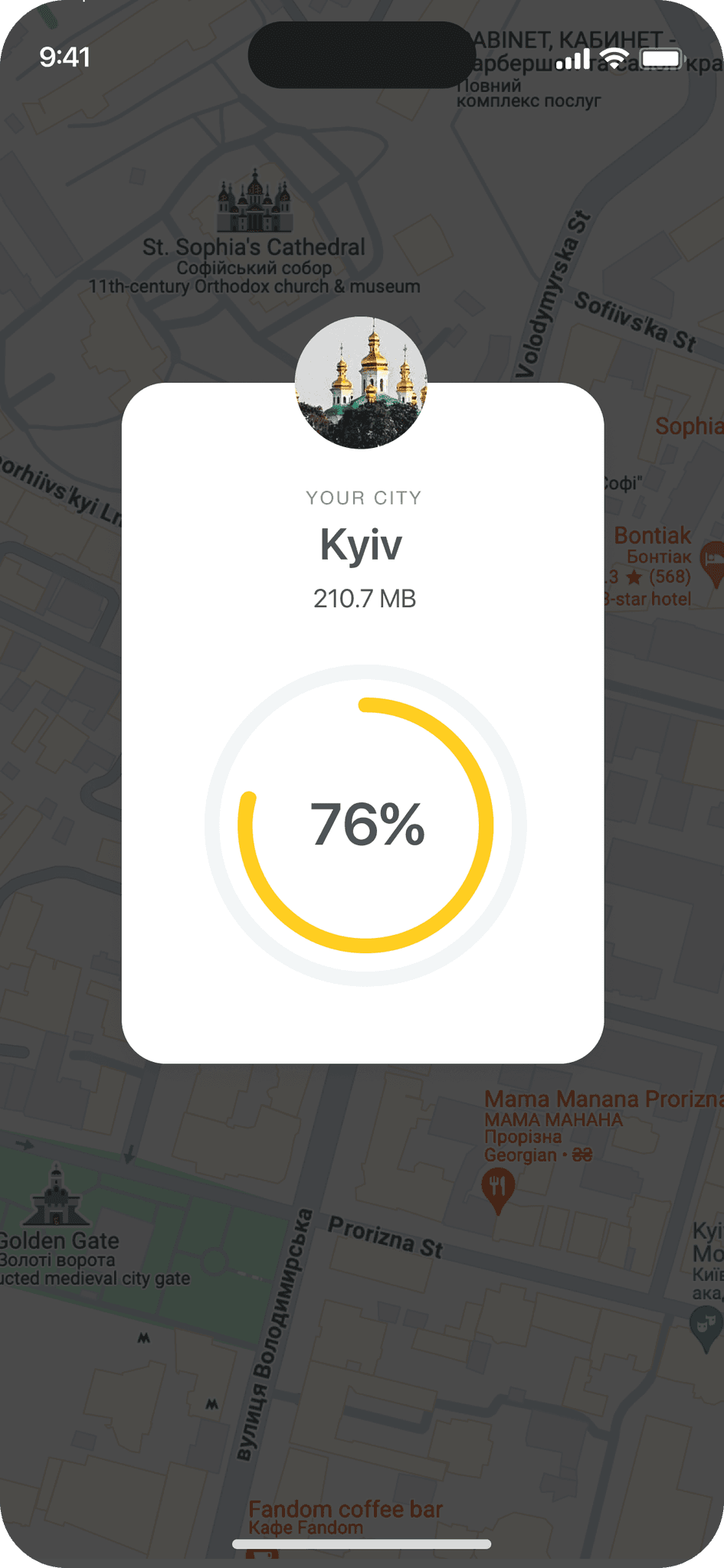
It would be grate to animate a process of city loading, to know how much is left.
It would be grate to animate a process of city loading, to know how much is left.
It would be grate to animate a process of city loading, to know how much is left.
It would be grate to animate a process of city loading, to know how much is left.
the clear version :
the clear version :
the clear version :
the clear version :
the clear version :
Refining design
Refining design
Refining design
Refining design
Refining design
On this step, first I created a static, high-fidelity Placever app design (keeping in mind all the conclusions from the previous phase of usability studies) that is a clear representation of a final product called design mockups.
After that, I created a high-fidelity prototype of the app.
On this step, first I created a static, high-fidelity Placever app design (keeping in mind all the conclusions from the previous phase of usability studies) that is a clear representation of a final product called design mockups.
After that, I created a high-fidelity prototype of the app.
On this step, first I created a static, high-fidelity Placever app design (keeping in mind all the conclusions from the previous phase of usability studies) that is a clear representation of a final product called design mockups.
After that, I created a high-fidelity prototype of the app.
On this step, first I created a static, high-fidelity Placever app design (keeping in mind all the conclusions from the previous phase of usability studies) that is a clear representation of a final product called design mockups.
After that, I created a high-fidelity prototype of the app.
Mockups
Mockups
Mockups
Mockups
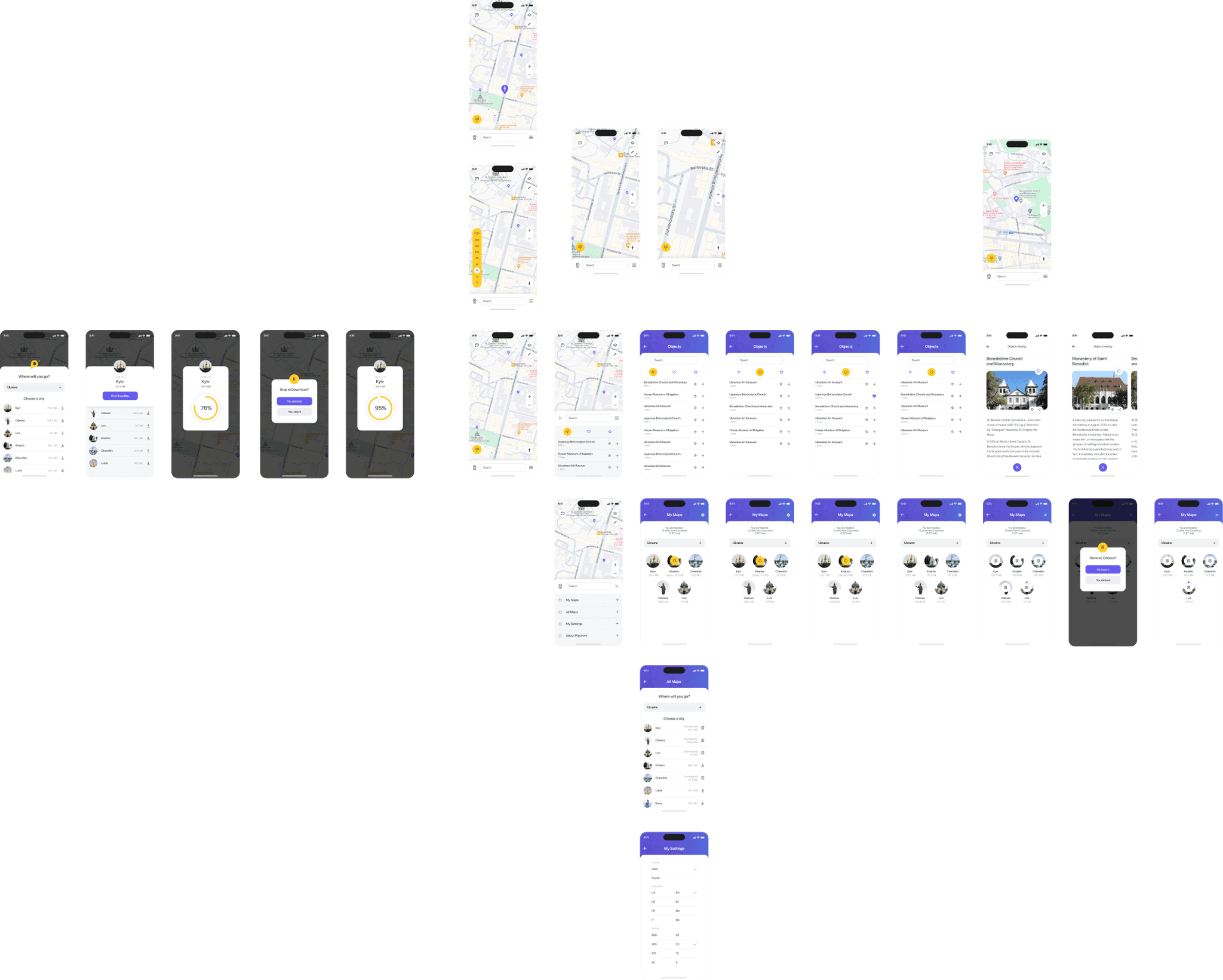
These are a high fidelity design that represents a final product
These are a high fidelity design that represents a final product
These are a high fidelity design that represents a final product
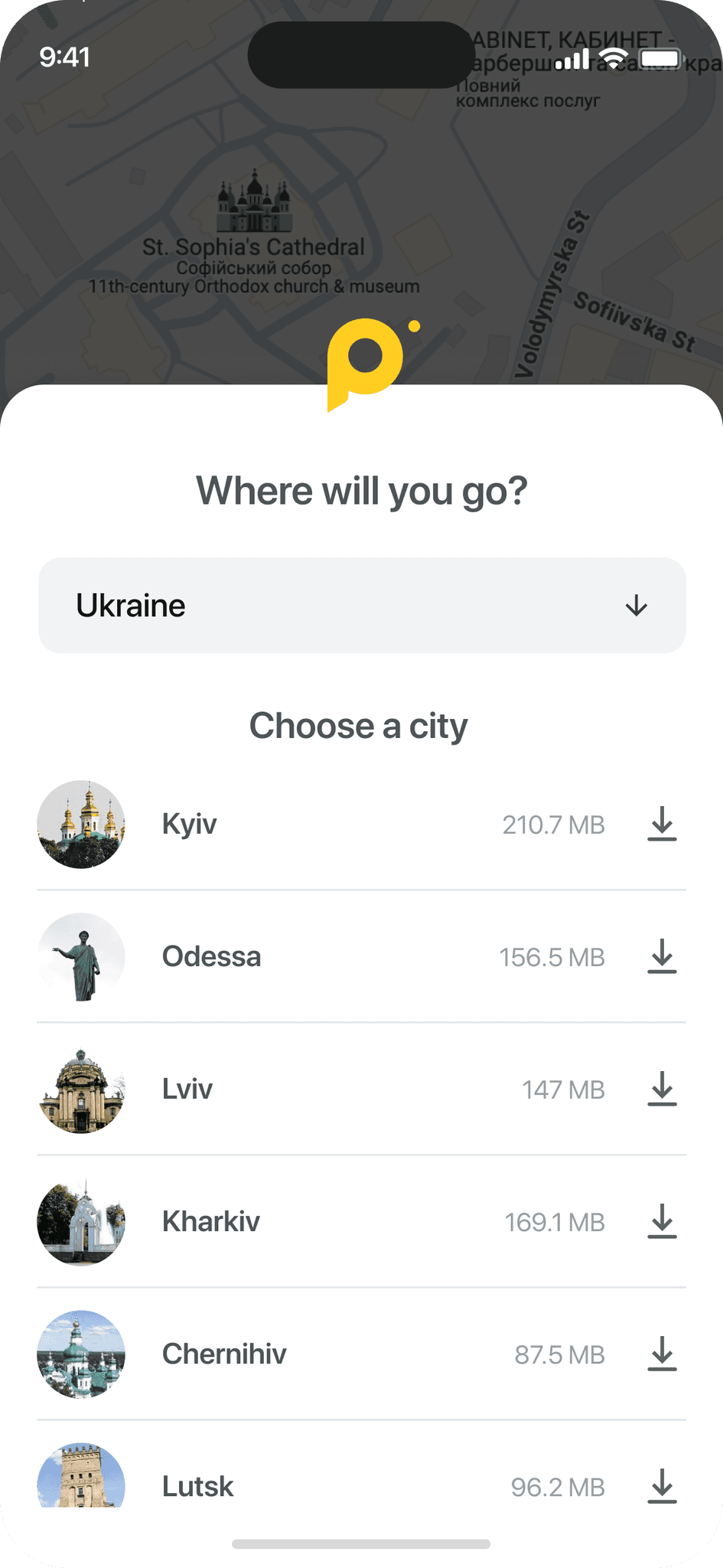
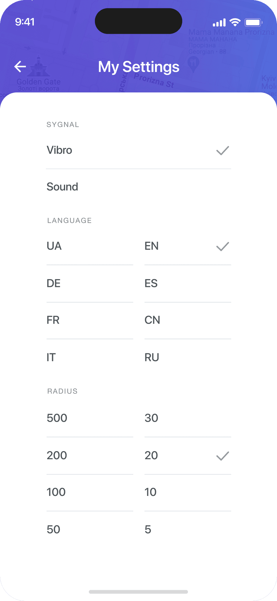
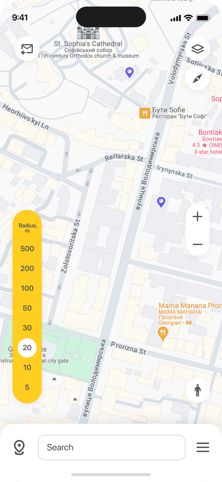
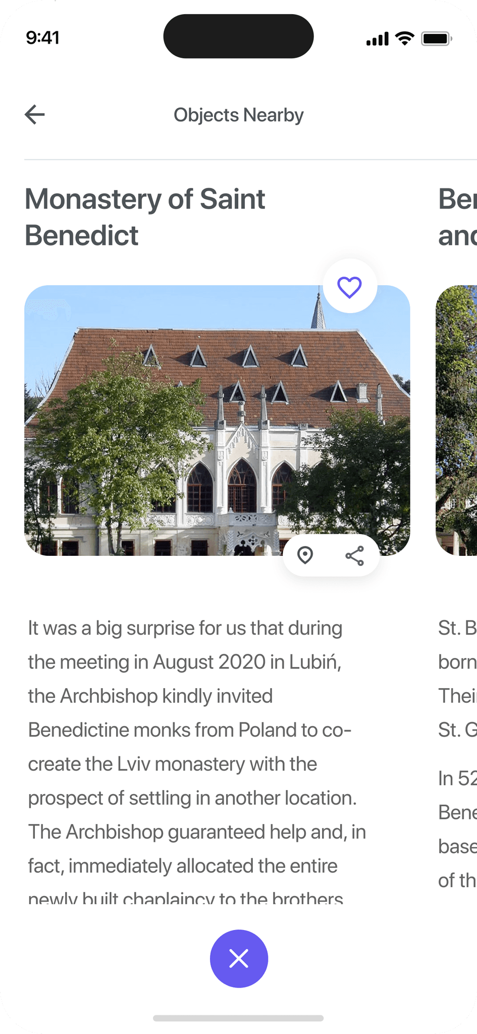
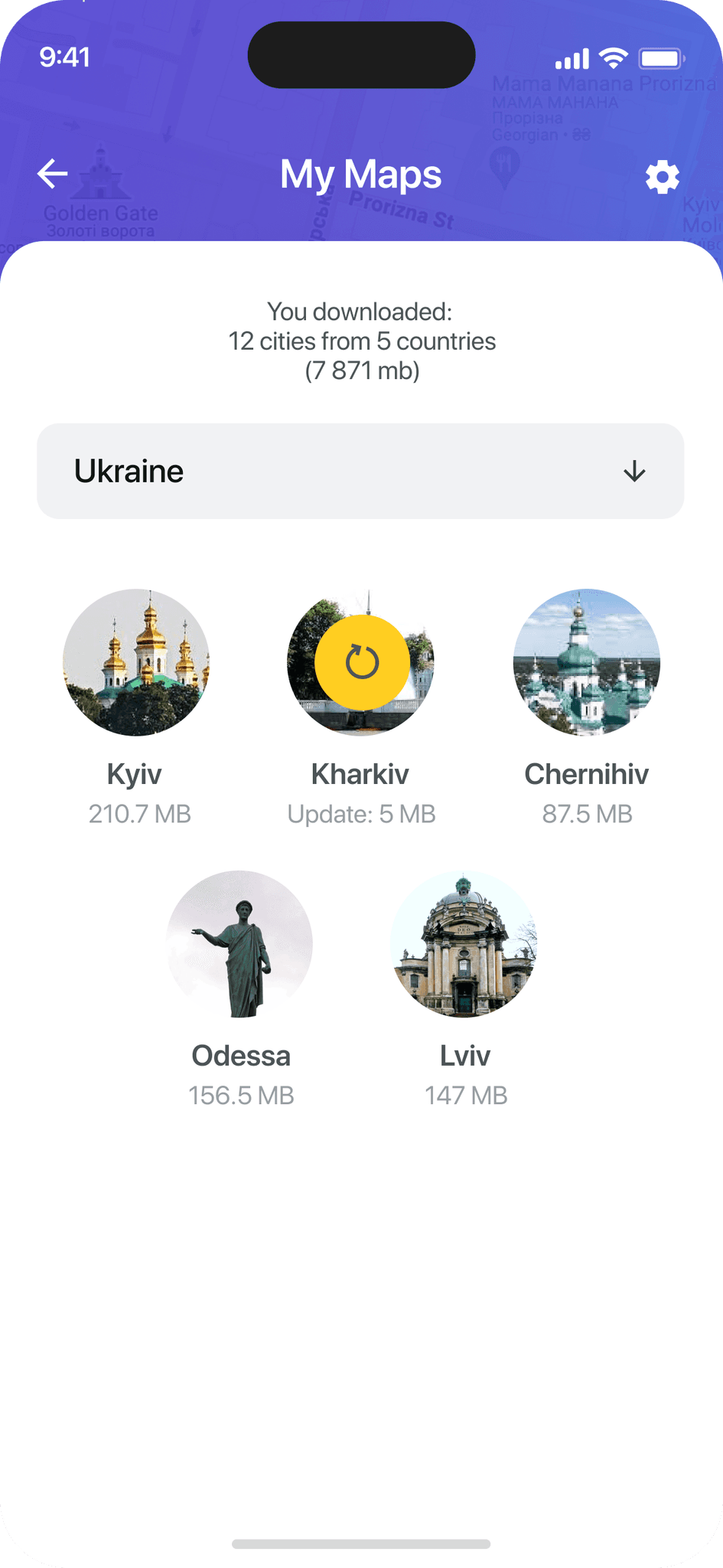
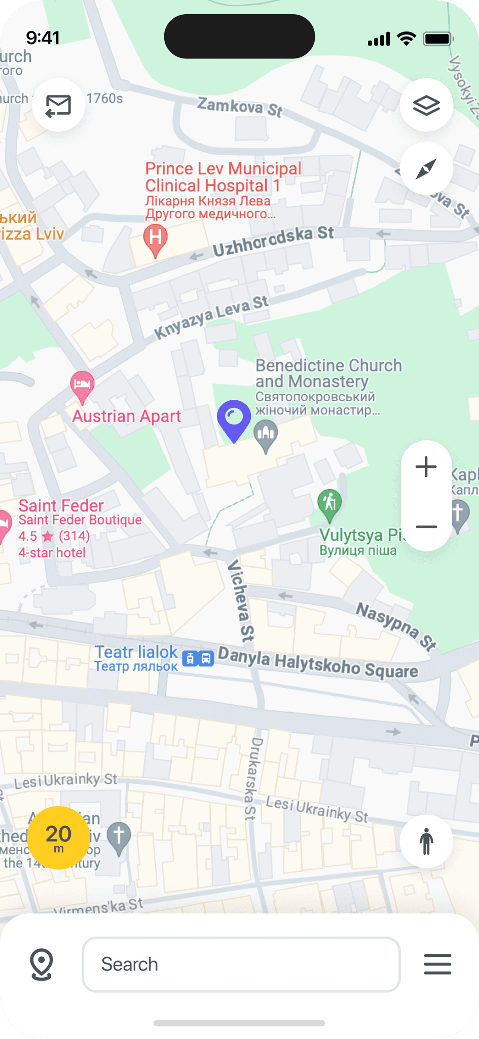
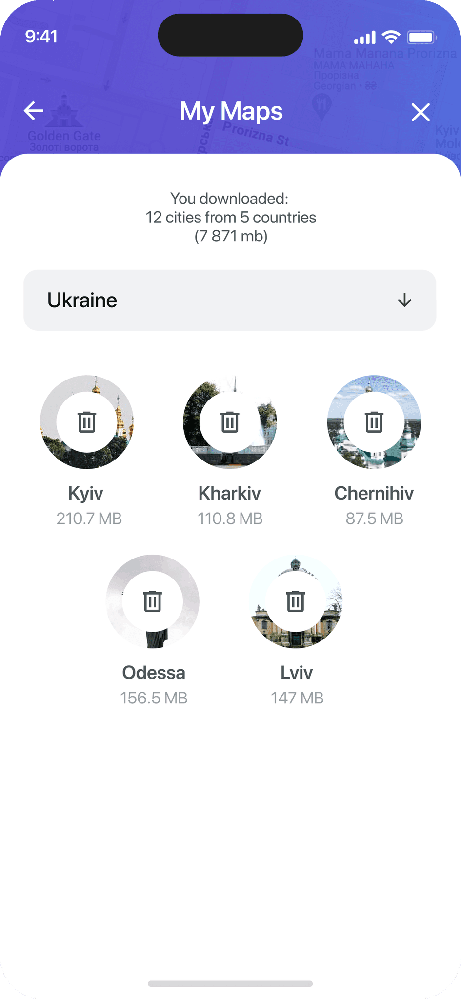
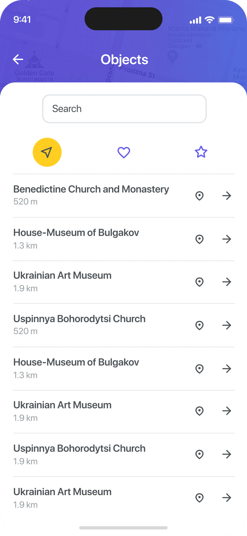
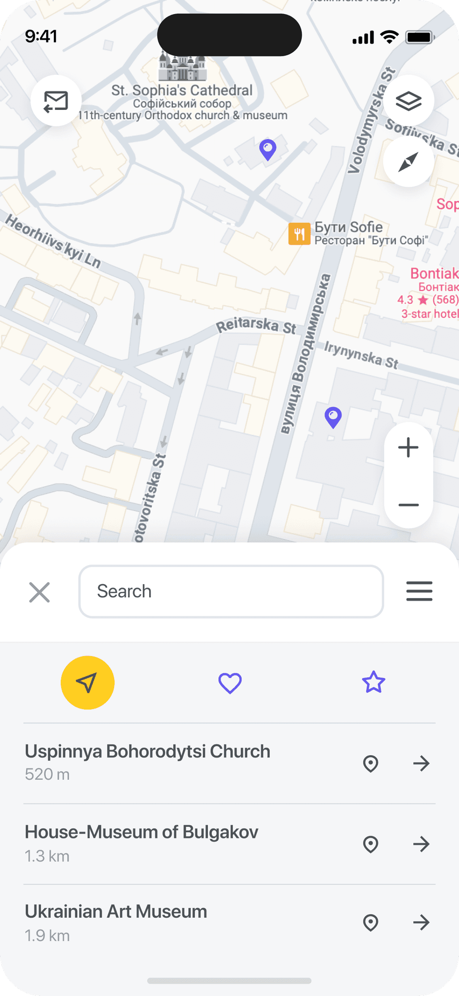
I created all the app pages mockups, incorporating the right design elements such as typography, color, and iconography. I also included all the necessary components and elements.
The goal was to demonstrate the final Placever app in as much detail as possible.
I created all the app pages mockups, incorporating the right design elements such as typography, color, and iconography. I also included all the necessary components and elements.
The goal was to demonstrate the final Placever app in as much detail as possible.
I created all the app pages mockups, incorporating the right design elements such as typography, color, and iconography. I also included all the necessary components and elements.
The goal was to demonstrate the final Placever app in as much detail as possible.




















about the project :
about the project :
M
Mockups
These are a high fidelity design that represents a final product
I created all the app pages mockups, incorporating the right design elements such as typography, color, and iconography. I also included all the necessary components and elements.
The goal was to demonstrate the final Placever app in as much detail as possible.


about the project :
M
High-fidelity prototype
High-fidelity prototype
High-fidelity prototype
High-fidelity prototype
High-fidelity prototype
It's the detailed, interactive version of designs that closely match the look and feel of the final product.
It's the detailed, interactive version of designs that closely match the look and feel of the final product.
It's the detailed, interactive version of designs that closely match the look and feel of the final product.
It's the detailed, interactive version of designs that closely match the look and feel of the final product.
I turned my mockups into a prototype that's ready for testing, using gestures and motion, which can help enrich the user experience and increase the usability of the app.
I turned my mockups into a prototype that's ready for testing, using gestures and motion, which can help enrich the user experience and increase the usability of the app.
I turned my mockups into a prototype that's ready for testing, using gestures and motion, which can help enrich the user experience and increase the usability of the app.
I turned my mockups into a prototype that's ready for testing, using gestures and motion, which can help enrich the user experience and increase the usability of the app.


Choosing a city to download
Choosing a city to download
Choosing a city to download
Choosing a city to download
Map, scaling, my place, radius selection
Map, scaling, my place, radius selection
Map, scaling, my place, radius selection
Map, scaling, my place, radius selection
Places menu: nearby, favourites, rating
Places menu: nearby, favourites, rating
Places menu: nearby, favourites, rating
Places menu: nearby, favourites, rating
Adding to favourites, place selection
Adding to favourites, place selection
Adding to favourites, place selection
Adding to favourites, place selection
Separate place page, show it on the map
Separate place page, show it on the map
Separate place page, show it on the map
Separate place page, show it on the map
Main menu
Main menu
Main menu
Main menu
Updating city info, deleting a city
Updating city info, deleting a city
Updating city info, deleting a city
Updating city info, deleting a city
Other menu sections
Other menu sections
Other menu sections
Other menu sections
Mastercard Connect (MC) is where Mastercard's customers, like large banks, come to manage their business.
looking forward :
looking forward :
looking forward :
looking forward :
looking forward :
Outcome
Outcome
Outcome
Outcome
Now, finally, it remained to pay attention to several takeaways and plan some further steps.
Now, finally, it remained to pay attention to several takeaways and plan some further steps.
Now, finally, it remained to pay attention to several takeaways and plan some further steps.
Now, finally, it remained to pay attention to several takeaways and plan some further steps.
Takeaways
Takeaways
Takeaways
Takeaways
Takeaways
Impact:
Impact:
Impact:
Impact:
Impact:
Our target users have described the Placever app's design as intuitive, user-friendly, and easy to navigate. They can effortlessly select a city, quickly access information about different locations, and read engaging descriptions.
Our target users have described the Placever app's design as intuitive, user-friendly, and easy to navigate. They can effortlessly select a city, quickly access information about different locations, and read engaging descriptions.
Our target users have described the Placever app's design as intuitive, user-friendly, and easy to navigate. They can effortlessly select a city, quickly access information about different locations, and read engaging descriptions.
Our target users have described the Placever app's design as intuitive, user-friendly, and easy to navigate. They can effortlessly select a city, quickly access information about different locations, and read engaging descriptions.
What I learned:
What I learned:
What I learned:
What I learned:
What I learned:
The main thing I learned that even a small change can have a huge impact on the user experience. The most important takeaway for me is to always focus on the real needs of the user.
The main thing I learned that even a small change can have a huge impact on the user experience. The most important takeaway for me is to always focus on the real needs of the user.
The main thing I learned that even a small change can have a huge impact on the user experience. The most important takeaway for me is to always focus on the real needs of the user.
The main thing I learned that even a small change can have a huge impact on the user experience. The most important takeaway for me is to always focus on the real needs of the user.
Next steps
Next steps
Next steps
Next steps
Next steps
Conduct follow-up usability testing on the new app iteration.
Conduct follow-up usability testing on the new app iteration
Conduct follow-up usability testing on the new app iteration
Conduct follow-up usability testing on the new app iteration.
Conduct follow-up usability testing on the new app
iteration.
Identify any additional areas of need and ideate on new features.
Identify any additional areas of need and ideate on new features.
Identify any additional areas of need and ideate on new features.
Identify any additional areas of need and ideate on new features.
Identify any additional areas of need and ideate on new
features.
To get in touch :
To get in touch :
To get in touch
To get in touch :
To get in touch :
Connect
Connect
Connect
Connect
Connect
Let me help with a great visual solution for your business.
Let me help with a great visual solution for your business.
Let me help with a great visual solution for your business.
Let me help with a great visual solution for your business.
Let me help with a great visual solution for your business.
Click to copy :
Click to copy :
Click to copy
Click to copy :
Click to copy :


Works
Overview
Research
Wireframes
Design
Outcome
Works
Overview
Research
Wireframes
Design
Outcome
Overview
Research
Wireframes
Design
Outcome
Works